design drafting from an antique fabric
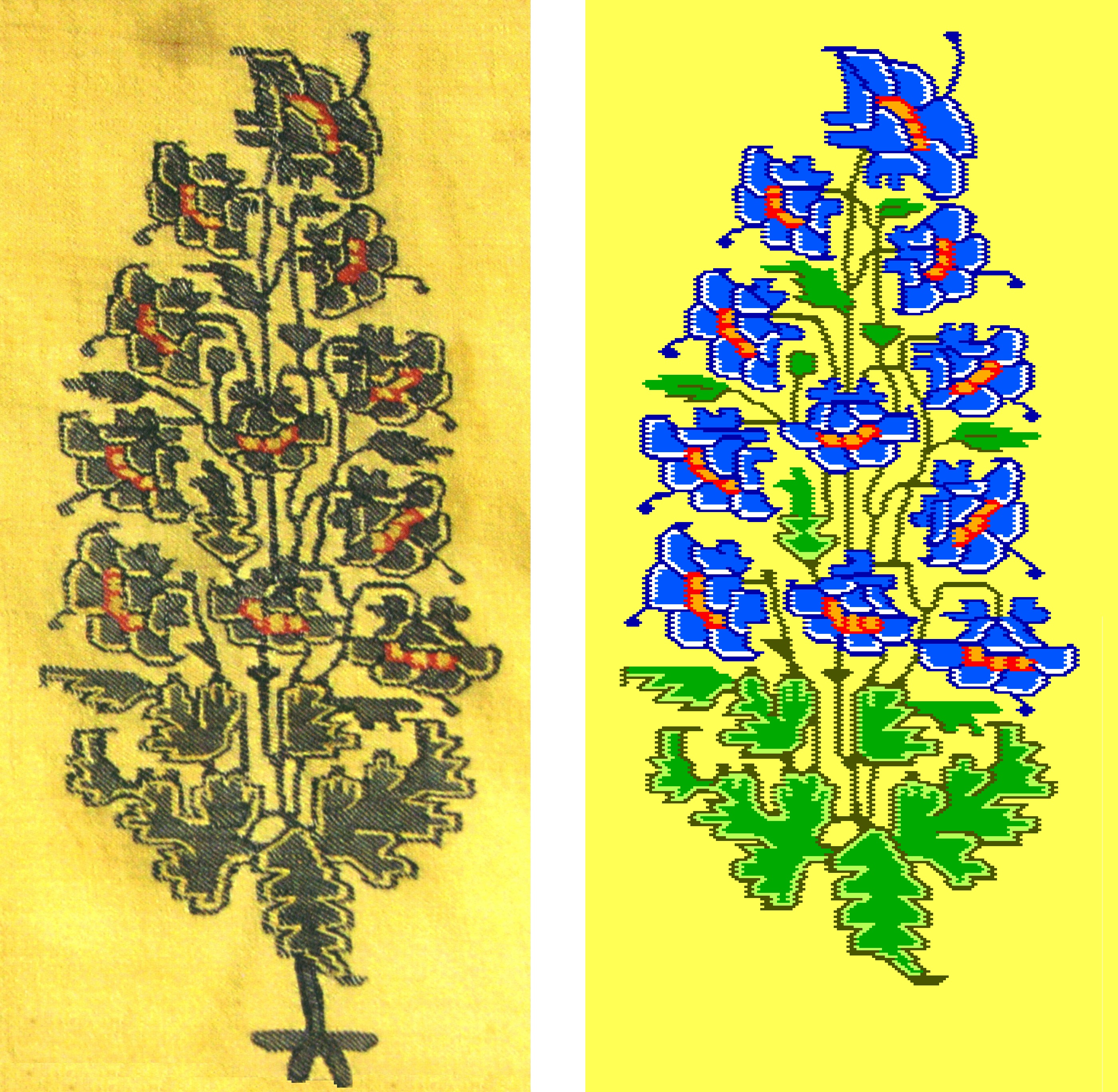 The illustration above shows one of two copies of the 17th-century boteh motif in my source, Plate 5-1 from “Pashmina: The Kashmir Shawl and Beyond” by Janet Rizvi with Monisha Ahmed (Marg Publications, Mumbai, 2009, p. 76, photo by Dilip Kumar), compared with the diagram I drafted of it using Stitch Painter software. Of the two copies of the motif in the photograph, it is slightly lighter and easier to read, second from the lefthand edge of the fabric in a row of at least 3 copies (seen in another published source). I made overall adjustments to the scale and aspect ratio of my diagram to match the photograph, just as in weaving these proportions would be subject to the size of the yarns used and the balance of warp and weft densities. In the diagram, where every two weft stitches is represented by a solid oblong “brick” of colour, the appearance of the horizontal dimension is exaggerated.
In this long, technical article I want to describe both the basic process of drafting a fabric motif using Stitch Painter, along with difficulties encountered in this particular example that might well crop up elsewhere.
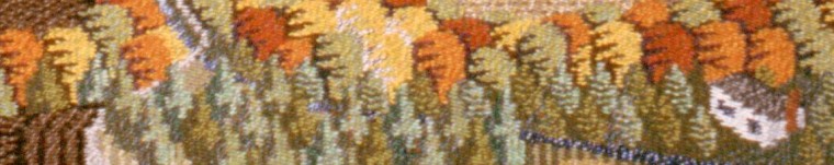
Comparing the two copies of the motif in Plate 5-1 shows a high degree of similarity based on repeated design information, not just visual resemblance. Woven side by side, probably by the same hand, each weft pick from edge to edge of the fabric would contain the same sequence of colour changes for each copy. Whether this was based on a diagram, a series of instructions in text, or some other method of memorization, is hard to say – I have seen just one citation about the invention of the “talim” or text-based method, dating it to the 18th century. On the other hand, there are many irregularities between and within the woven copies, and between and within yarn colours, that may be due to uneven thicknesses of the very fine handspun pashmina yarn. No information was given about the dimensions or threadcount of the original fabric. The angle, closeness, and linearity of the twill-weave texture – the delicate, diagonal ridges formed by the progression of treadlings – is very wavey and irregular. All these variations make it hard to estimate the number of rows and columns used to represent design details, all the more necessary to see the individual stitches. I found the balance of the weave is short, more weft picks per inch than warp ends, tending to compress and flatten the imagery.
What inspired me to attempt a reconstruction of this shawl design, the particular image I had seen before and representative of a favourite era of faithful botanical portraits, was the large scale and sharp lighting of the printed photograph. It’s large and detailed enough to see the fabric texture, and it shows well on the page, though in close analysis the angled lighting may have caused problems interpreting highlight and shadow in the light and dark yarn colours, that flat lighting would have made easier. However good this reconstruction may be, being given an opportunity to take original photographs for the purpose, would prompt a comprehensive revision.
The strategy I’ve used before, for beginning to draft a design made up of many components and less important interconnections, is to draft each component by itself and then assemble the parts. The first step is to define the height and width of a component area by cropping it from the source photograph, because that will correspond to the number of rows and columns of the Stitch Painter grid it will be pasted to. Though I could assume that the vertical or warp-wise dimension of the fabric was plumb, in my first attempts I struggled to draft details that I felt sure followed the horizontal line of the weft pick, but were slanted in the photo. This could easily happen when the fabric was laid out to be photographed, but would show up mis-aligned on the rigid Stitch Painter grid. It reminded me of my experience with early Optical Character Recognition software, where if the text was not perfectly horizontal when scanned, the OCR function made many more errors interpreting the letters. Therefore, I manipulated the cropped photo to try to restore it plumb and square using the “skew” feature of my photo-editing program.
Then to estimate the size of the grid area required, I made several traverses of the photo both vertically and horizontally, quickly counting the number of diagonal twill ridges crossed from edge to edge. Not as easy as it sounds, but rather than try to get one count absolutely right, I made several and averaged them. The number of ridges crossed horizontally is the number of grid units of width, while each ridge crossed vertically calls for two rows of grid height. The twill ridge is produced by the weave unit made up of 4 warp threads and 4 weft threads, but each oblong “brick” unit of the Stitch Painter grid represents 4 warp threads (2 raised and 2 lowered) and only 2 weft threads. Readers of my previous articles will recognize this is because the design instructions to the weaver, corresponding to a row of grid units, change for every 2 weft picks, not just every 4 weft picks.
From this point on, I am primarily working in the Stitch Painter program, accessorized with both the “Beading” module which provides the “brick” grid (“Comanche”) that I’ve found uniquely useful for this process as well as a “half-drop” (“Peyote”) grid, and the “Full Colour Import” module. It was described as a “grid-based paint program” by Ingrid Boesel, the weaver who pointed it out to me, and is available from the developers at cochenille.com.
From the estimate of the grid area I need for the component I will work on, I “Set Document Size” a few rows and columns larger. I copy-and-paste the photo image onto selected grid areas in several trials: as counted, slightly larger and smaller, even and odd numbers of rows and columns, beginning on whole or half-unit rows – looking for the clearest rendering of the design in the photo, and checking for a corresponding number of units in linear details of the photo and the grid. In theory, an error of one row or column, the difference of odd or even, will disrupt even the center of the design area. I use greater rather than fewer number of colours in the paste process, waiting to make corrections by eye instead of forcing the software to make sharp decisions about subtle details.
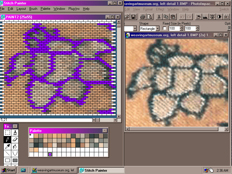 To begin the process of hand-corrections, I set up a working screen view of Stitch Painter grid and original photo side-by-side, such as this one from an earlier project. I draw in corrections in a contrasting colour, beginning with the most clearly visible details and ranging out and around from there. I keep criss-crossing the design area connecting, adjusting, counting twill ridges and units in straight-line details, trying to accommodate all the evidence of how the design was woven. The design may mesh easily, or any correction to one area may distort another. I try not to erase background details of the paste process before they are incorporated in the corrected version, and don’t fill areas or simplify clutter until the outlines are finalized.
Once I have prepared the individual components, I’m ready to begin combining separate design files on one larger grid. Now is the time to get rid the stray colours left over from the paste process, and standardize the colours I’m using in the same palette positions in all component designs, to copy-and-paste them together. I piece together component designs carefully for correct placement and proportions. Accurate as they may have seemed individually, they may suddenly appear out of proportion to their neighbours or space available. Sometimes this coordination goes surprisingly well: to fill in a missing area of complicated stems and foliage, I decided to copy-and-paste the relevant portion of the photograph, estimating the grid space by eye instead of painstaking counting, and it fell neatly into place.
In view of uncertainties of transcription encountered so far, I made some general decisions verging on artistic license: I determined that lines (stems) and outlines, variable as they appeared due to yarn size, should be no more than two rows or 1 1/2 columns in thickness. Because it was hard to distinguish the outline from the fill tones in both leaves and flowers in the photo, details may be inconsistent. Some small unusual bits of foliage in the upper portion were hard to identify and therefore to represent: leaves? buds? I added center-vein details to small leaves. Perhaps most controversially, I removed the heavy foot device leaving the motif floating, though this is rarely seen in shawl motifs.
With the benefit of some experience weaving these designs, I should examine the design for unimportant, difficult-to-weave details (necessitating an extra weft bobbin for 1 or 2 grid units, for example). Where awkward or inefficient weaving details were encountered, it was usually my “improvements” that were responsible.
Once all the transcribing and editing work has been done, it is important to remember it is all based on the front view. Flip the entire design horizontally, using the “Brush” tool, to obtain the weaving-side view. Name each colour used with a short, distinctive combination of letters. In the talim system, the numbers of grid units (“nals”) and the relevant colour are combined in single, shorthand symbols. “Set Origin” to count the rows and grid units from the bottom left corner. “Generate Text Summary”. Copy the text summary file to a word-processing program and give it a clear, roomy page layout. Number the pages.

