Mapping Kashmir shawl designs from antique fabrics

•08/11/2024 • Leave a Comment

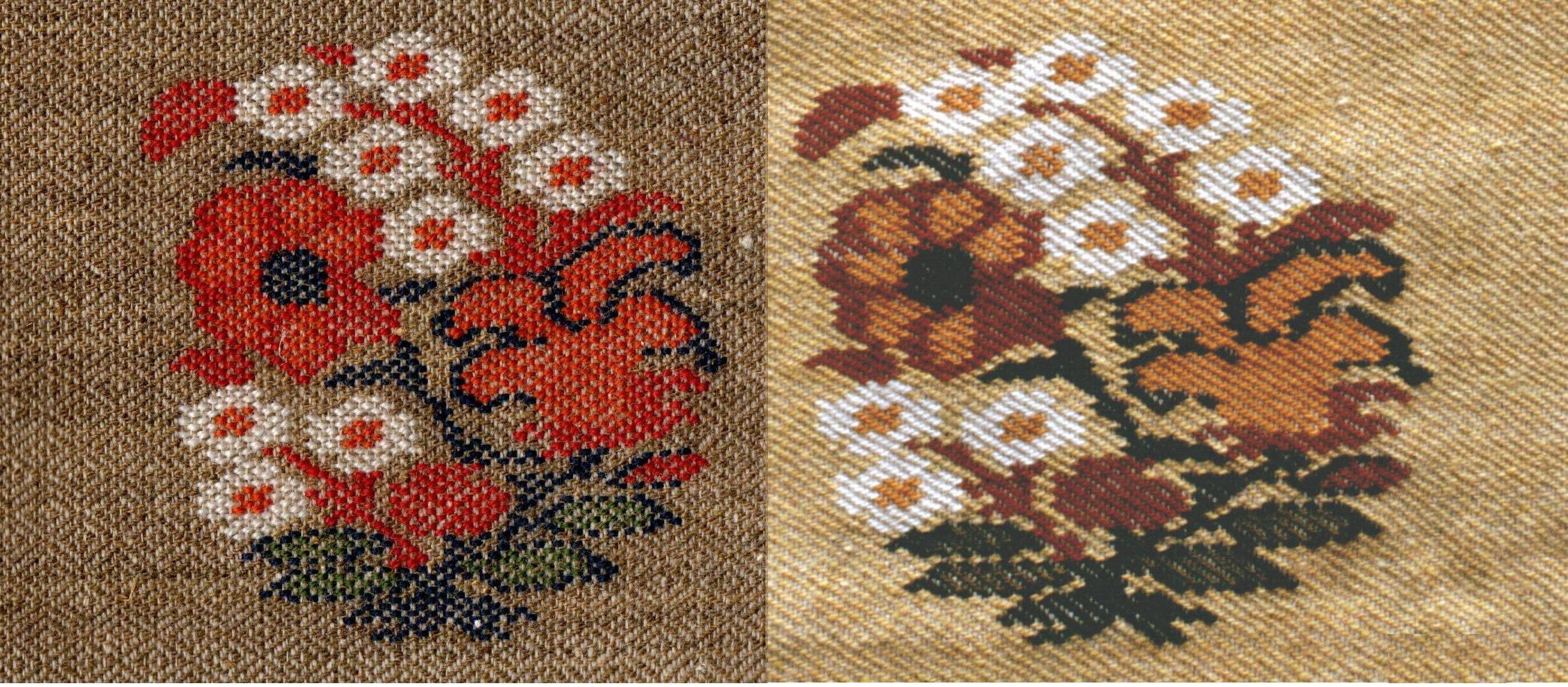
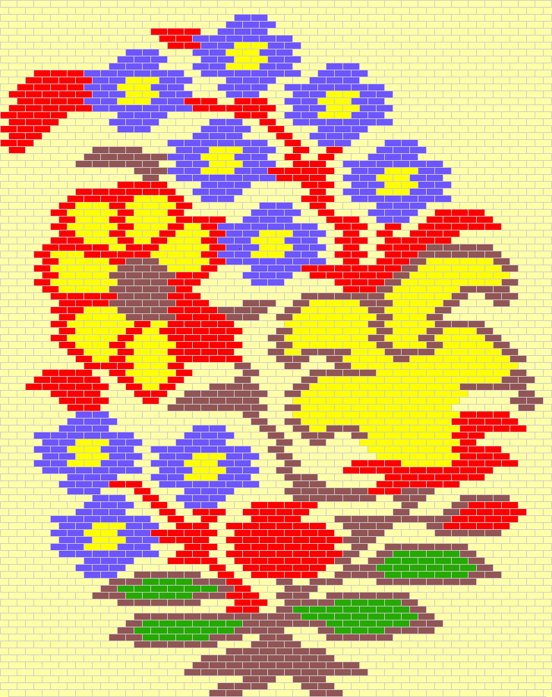
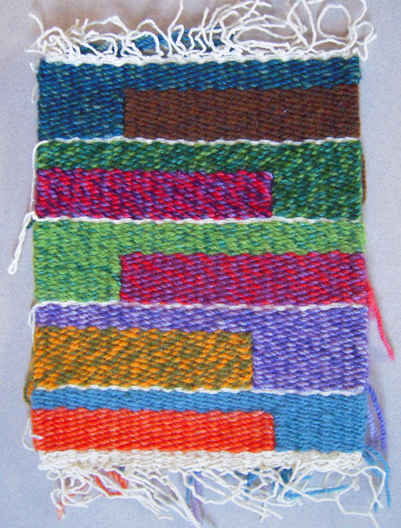
The design or motif displayed on a kani-woven fabric is the result of the conversion of a drawing into precise digital instructions that correspond to the weaver’s way of working. As a tapestryweaver in a different tradition, I knew the information I needed was the colour and the extent traveled by each weft in succession across the width. I have always had a strong sense of the grid structure of plain-weave tapestry, as well as weaving in general. In tapestry it is a matter of getting the right colour of weft in each location in the grid, to display the design and to hold together as a piece of cloth.
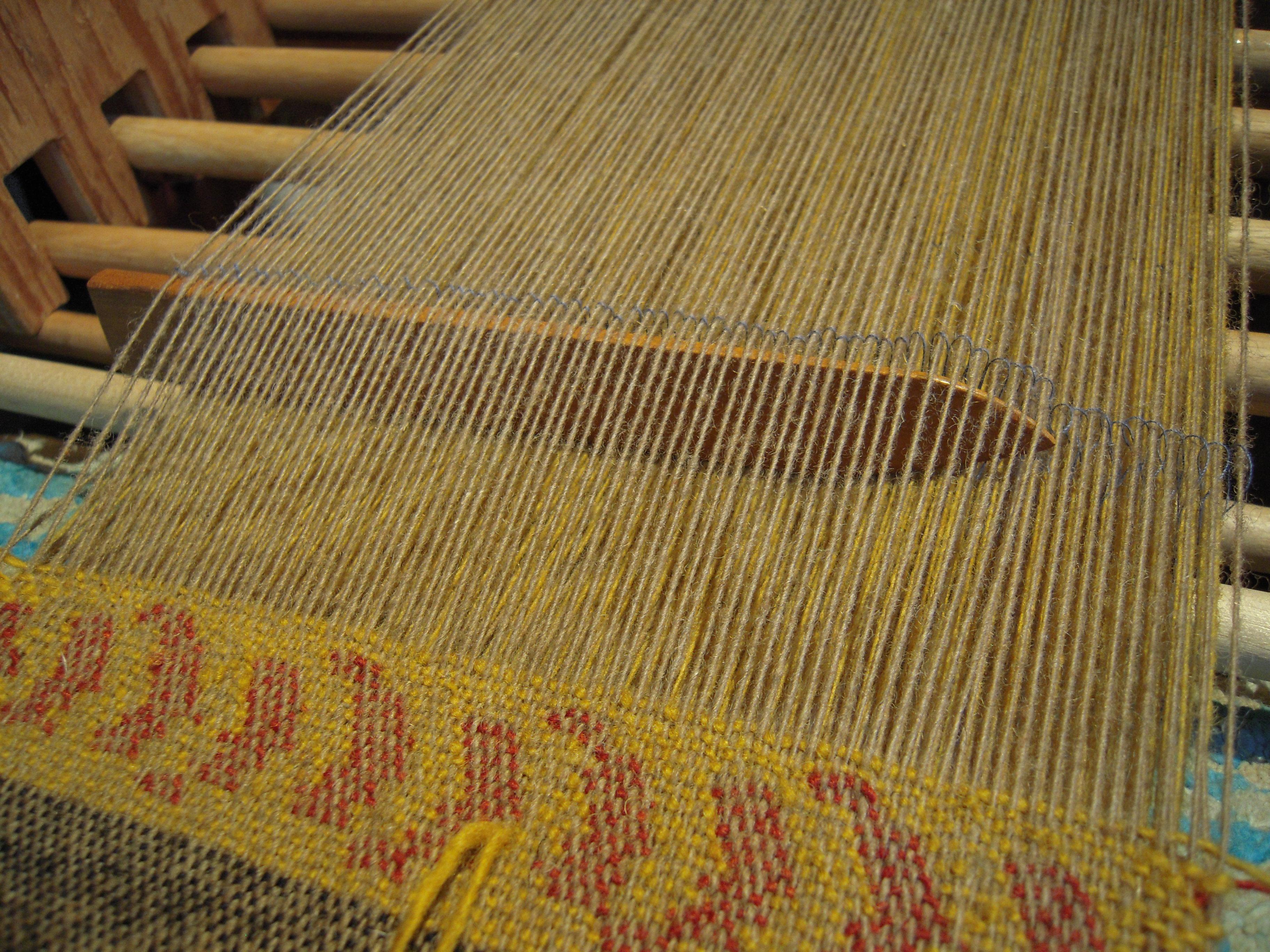
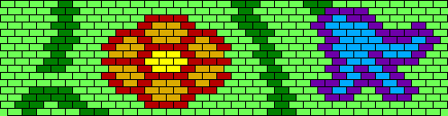
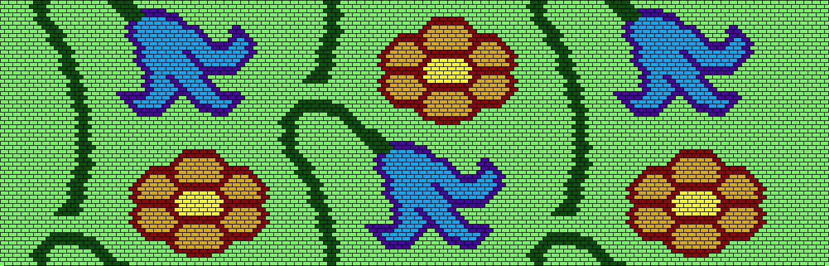
The structure of kani weaving is known as 2/2 twill, with a repeatable weave-unit of 4 weft picks across 4 warp ends. At each treadling the warps are displayed two-up-two-down; the two-up are called a “nal” (pair), and passing under the number of nals is the distance the weft crosses, to be exchanged for the next weft of a different colour. The weaver is working from the back side of the fabric, so one nal appears on the front as a stitch of colour crossing over 2 warps. At the next treadling, the raised nals all shift one warp to the left (as seen on the fabric front), developing into a noticeable line rising up at a 45 degree angle toward the left, that I will call the twill “grain”, like the grain seen in a piece of wood.
A simple question that dogged me for years was: For how many picks of weaving is the same line of instructions followed? …at every pick, every two picks, or all 4 picks that complete one weave-unit? As I have argued elsewhere, the answer is changing, and not in a good way.
The thing to look for in old fabrics is that those stitches corresponding to each nal usually appear in twos or multiples of two, following the line of the twill grain (because it is the next treadling for the same line of instructions). The modern practice would show up as rows or groups of 4 stitches, because the same instructions are repeated in 4 picks. Either way, it would be correct to draft the design on a brick grid – for the modern example, pairs of talim lines would be exactly the same. Each row of brick-grid units represents 2 picks of weaving, and each brick is one nal.
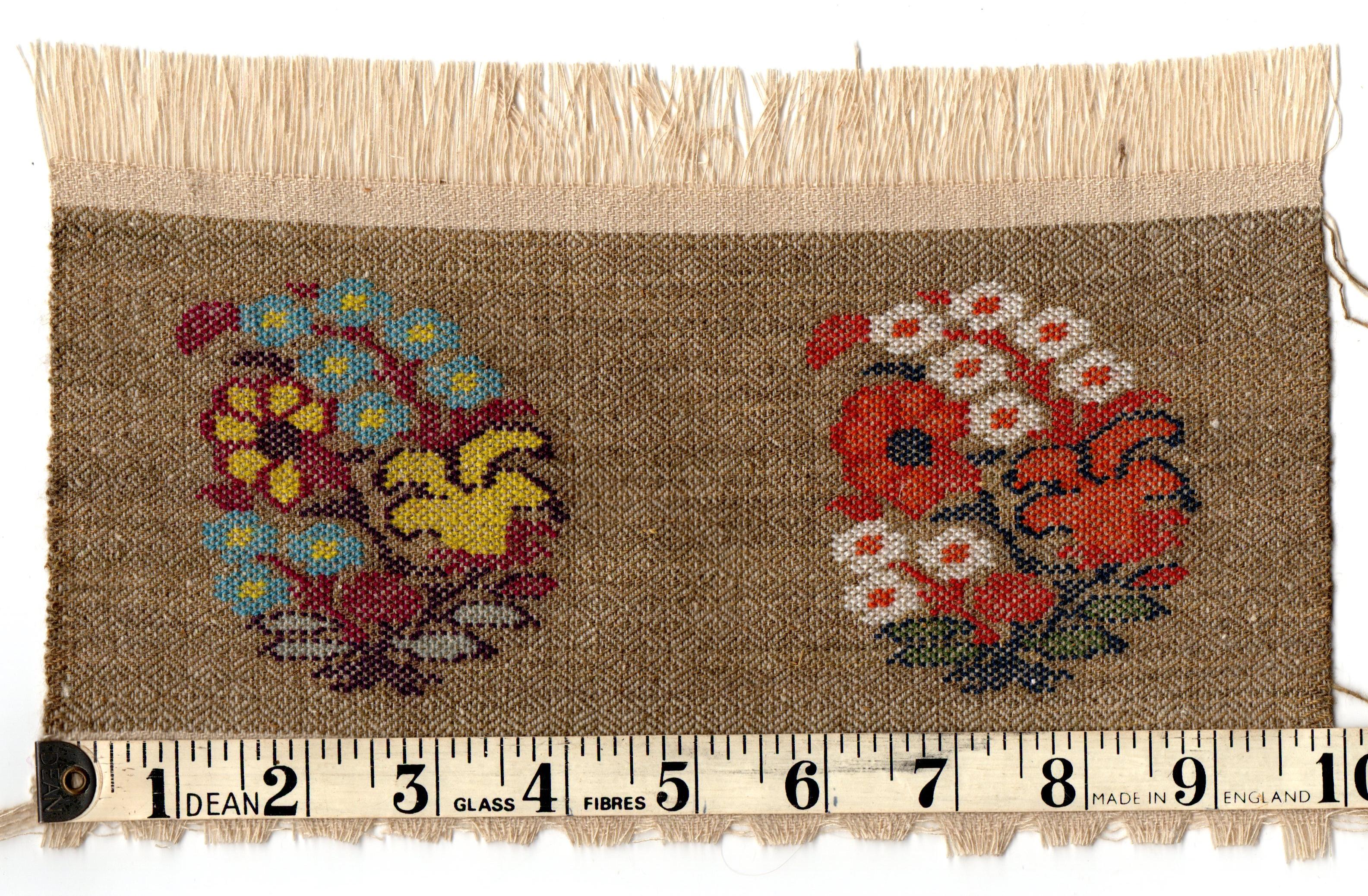
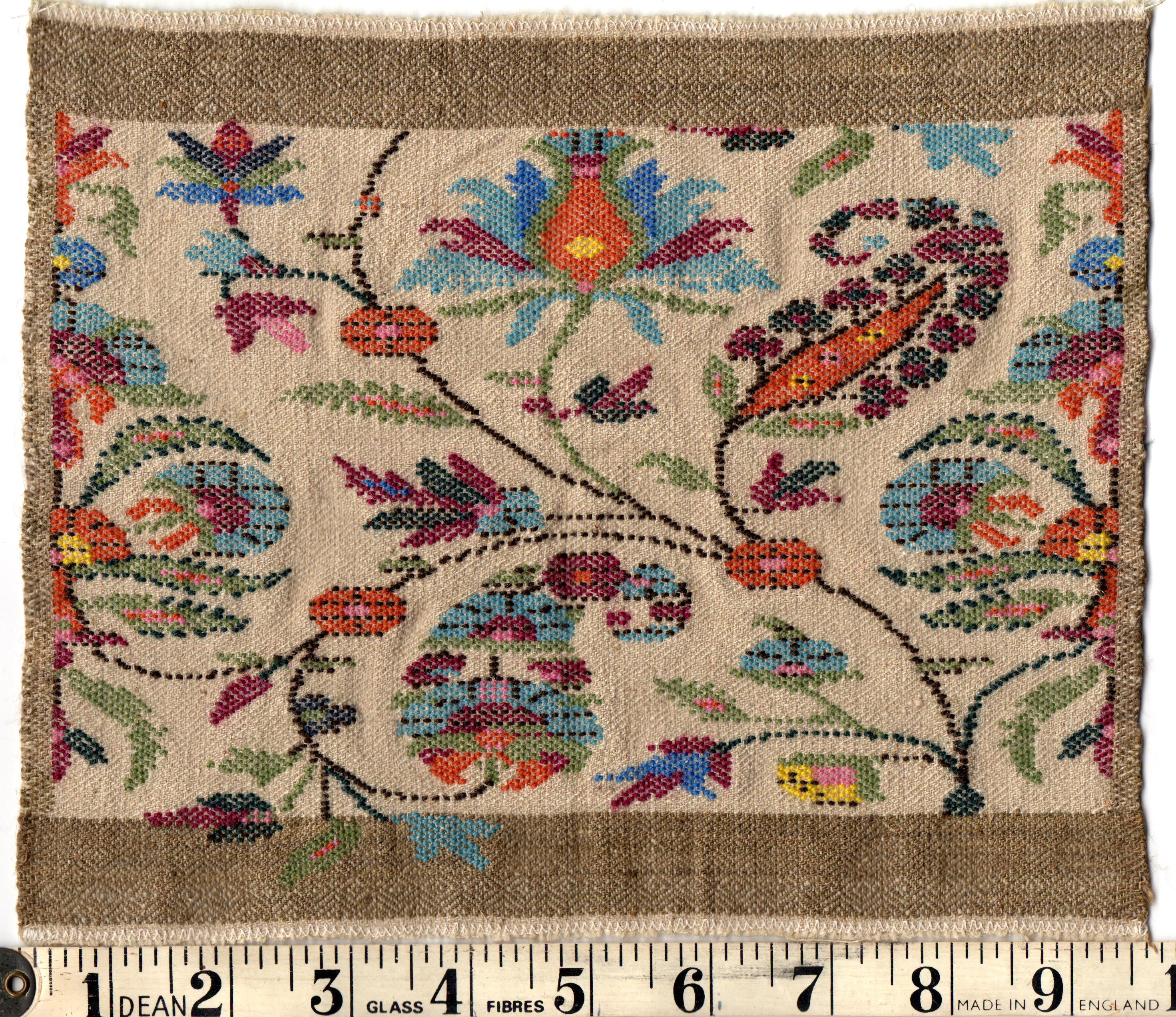
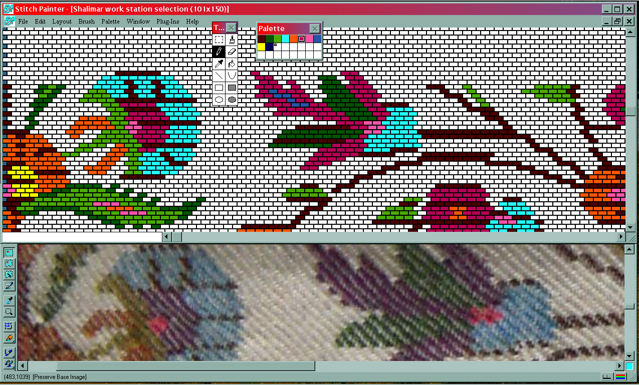
To look at the antique fabric, I am fortunate if I can start with a best-possible close-up photograph – carefully lighted and lined up on an improvised copy-stand – loaded into my image-editing program, where I can conveniently view it at magnifications up to 10x, the screen width of the fabric photo in nals. Careful lighting will help to distinguish colours, and sharp focus to settle questions. Printed photographs are rarely good enough.
Stitch Painter allows a continuous-tone image to be copied and pasted onto the grid, reducing it to a chosen number of colours. How much handwork this saves depends on the alignment of the fabric, the quality of the photograph, and a careful estimation of the matching numbers of rows and nals of the grid. Ultimately the degree of precision expected of row-by-row, step-by-step, interlocking instructions will require every detail to be checked by hand and eye.
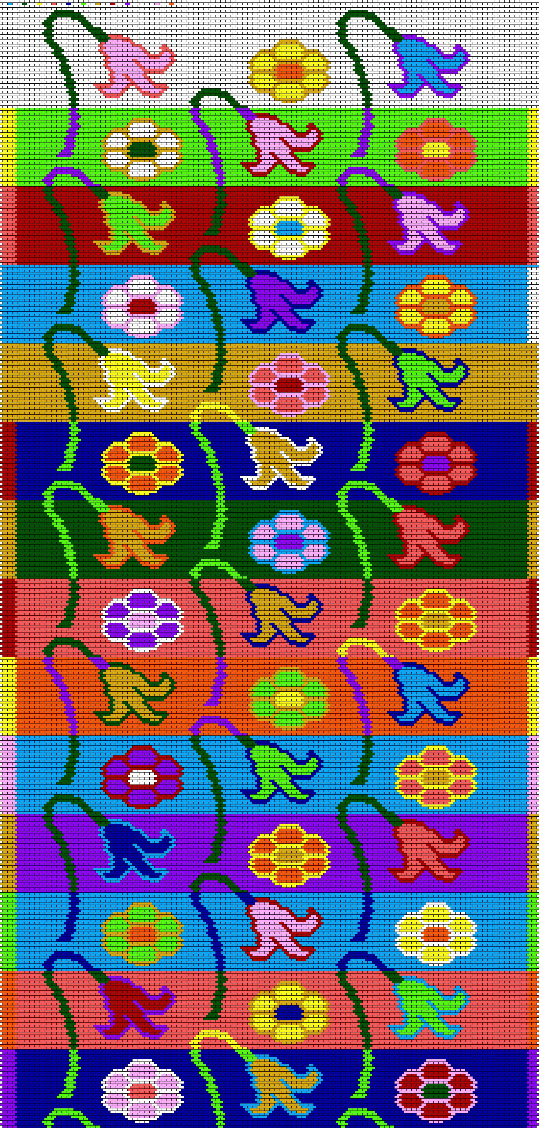
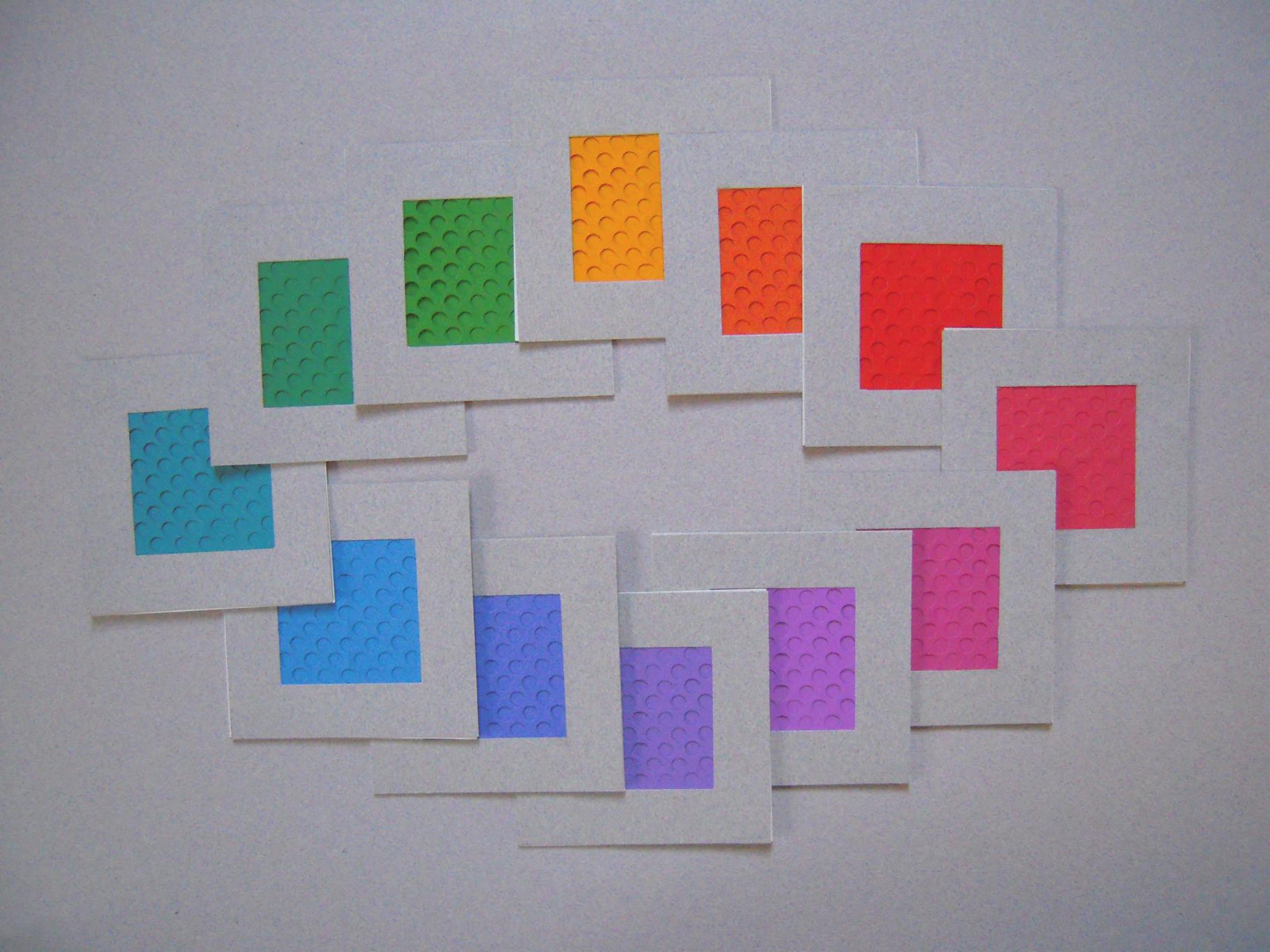
To begin, I prepare a blank brick-grid document with provisional dimensions of the expected number of nals in width and twice as many rows to cover the same extent lengthwise. Each brick-grid unit is one-half the height (representing 2 picks), compared to its width because it is spanning 4 warps (the 2 which were raised and the 2 which were not). Then I’ll make a selection of colours similar to the original fabric but easy to distinguish from each other. My completely self-contained work station on-screen shows enough of the grid to work on and enough of the fabric photo to compare it with. A good place to start would be anywhere the threads appear orderly: the warps not skewed, the wefts not undulating, the twill grain running straight, threads of uniform thickness, and other design details nearby to connect to.

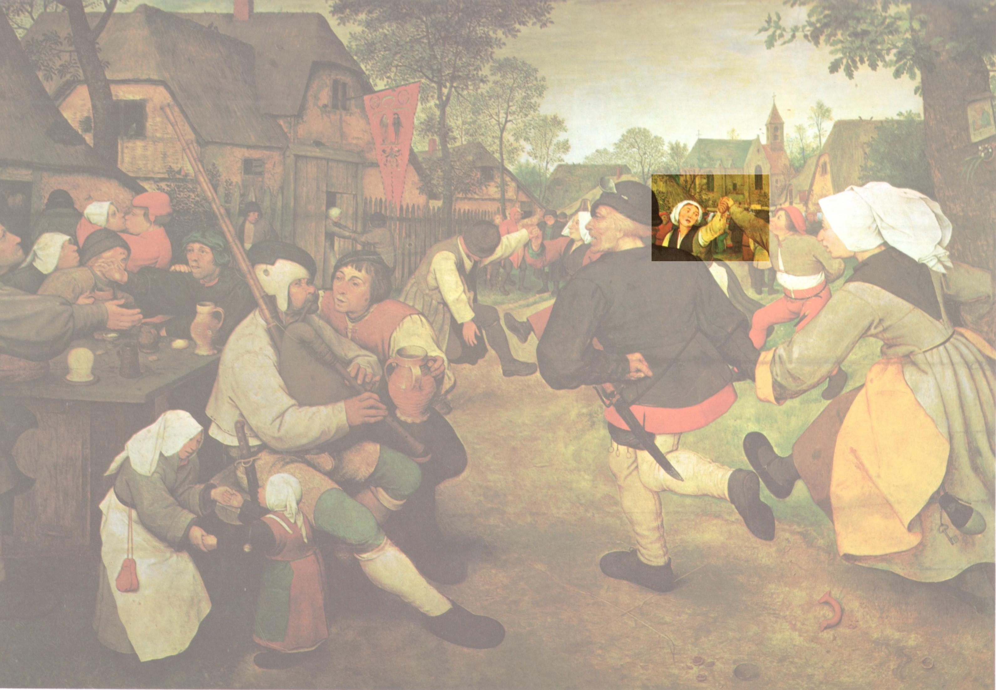
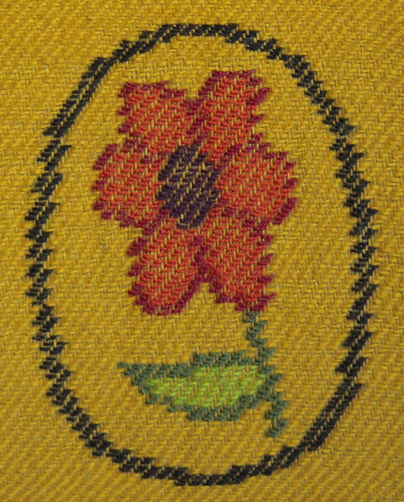
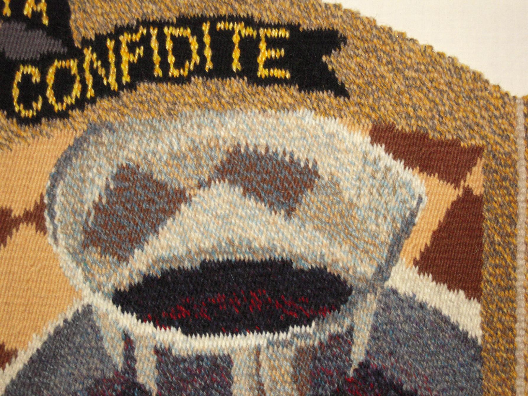
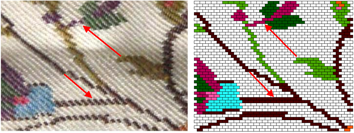
Look for straight lines in the design on the fabric: for straight warp-wise lines or edges that follow the same warp threads, the next weft that interacts the same way with the same warp threads is represented by the next brick in the design aligned above, which is in the second row above ( “A” in the photo). Straight horizontal or weft-wise lines are represented by several brick-grid units in the same row (“B”). Straight design lines that follow the twill grain rising to the left (“C”) are very useful – they may be visualized as bricks each overlapping the one below it by half, and counted at the rate of two stitches for each row of bricks. Counting and learning to estimate the number of stitches in these lines in the twill grain is important, and it is where all the resources of a sharp image, highly magnified, and the skill or experience to see it in brick-grid arrangement, come into play.

Locating design details is generally a question of extending straight lines and counting beyond known details from two or more directions, especially along the twill grain, to see where they meet. It’s a mixture of counting, estimating, and judgements about which stitches are in a straight line.
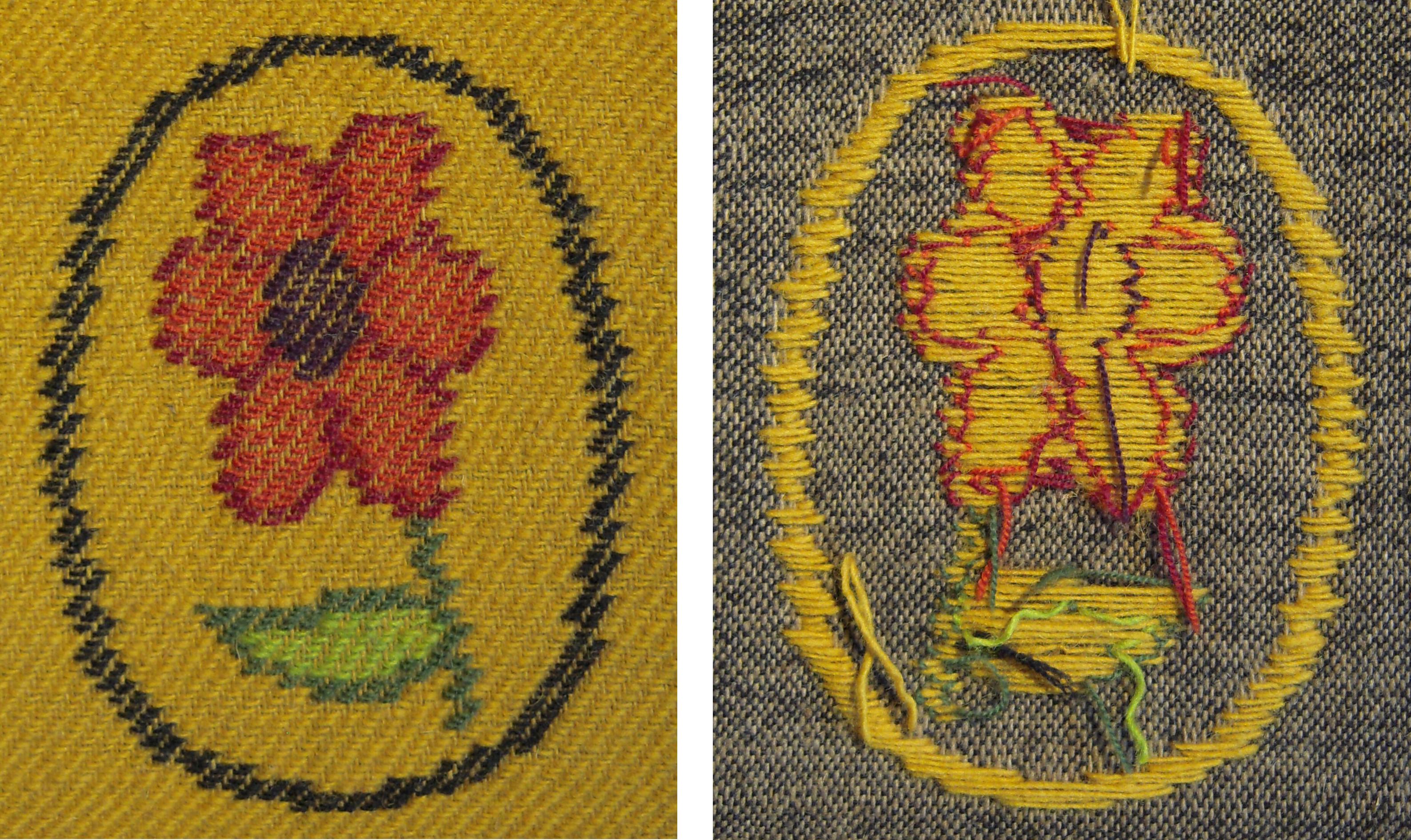
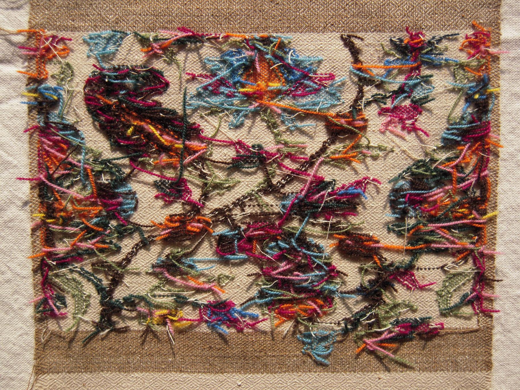
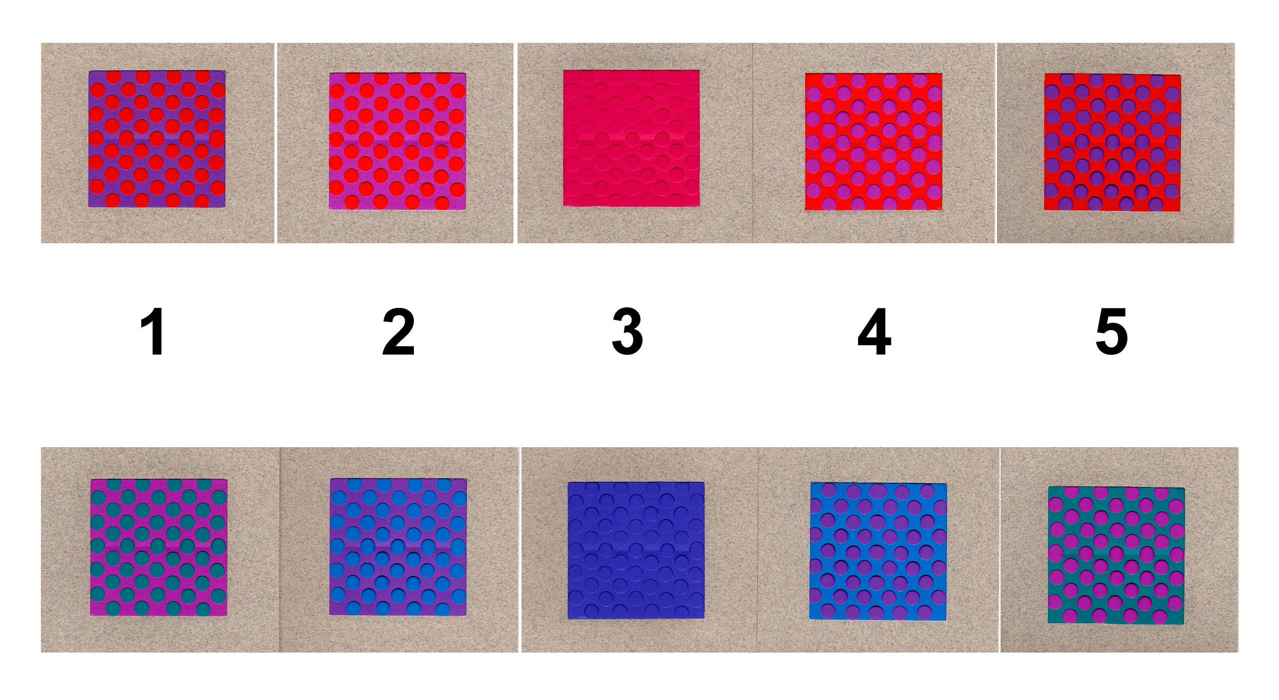
Sometimes it’s obvious that the weft threads are not the same thickness. Single-ply and two-ply wefts may be used, depending on the weaver’s stocks of the colours needed. Accents of strong colours such as black may be thinner for outlining, although their weaving-in follows the same instructions as other wefts. When the fabric is washed, or flexed and used, thick and thin threads will expand and collapse, making straight weft-wise lines hard to follow.
As these treasured and delicate fabrics were worn seasonally for many years, they were subject to many kinds of damage and pains-taking repair. No matter how skilled and “invisible” the mending and matching of repairs, on the thread-by-thread scale of analysing the design, repairs are very disruptive.
I have always enjoyed the comparison between tapestryweaving and assembling a jigsaw puzzle. That description is even more appropriate here, as I tend to assemble portions of the design by building outwards in any direction from portions already settled. Mostly these are filled in brick-by-brick, but occasionally as gaps diminish and conflicts arise, whole portions may need to be shifted slightly, or erased and rebuilt from another direction. Occasionally, in the midst of what seems like randomly deciding a brick here or there, I get the chance to follow around the outline of a clearly-defined shape that can be broken down like the two-part move of a knight in chess: so many rows of bricks diagonally, then so many double rows vertically, so many horizontally, and down vertically, until I arrive back exactly at my starting point. Or if not, why not? Sessions that end with being stuck, usually resolve when starting fresh.
Logically, if the process is known, then what varies in the fabric must be according to those digital instructions. If I had work experience as a kani weaver, I would be better able to appreciate the design modifications introduced by the weaver, especially after dozens of repetitions of the same motif, in rows or consecutively in side-borders. The talim system priviledged the designer over the weaver, and the original design over subsequent modifications. Any changes in scale or orientation of the motif required a complete new talim text. Comparing repeats of the same motif to determine what is the same is reassuring, when you find that it is exactly the same arrangement of stitches, even if it looks a little pinched or twisted because of variations in the yarns.
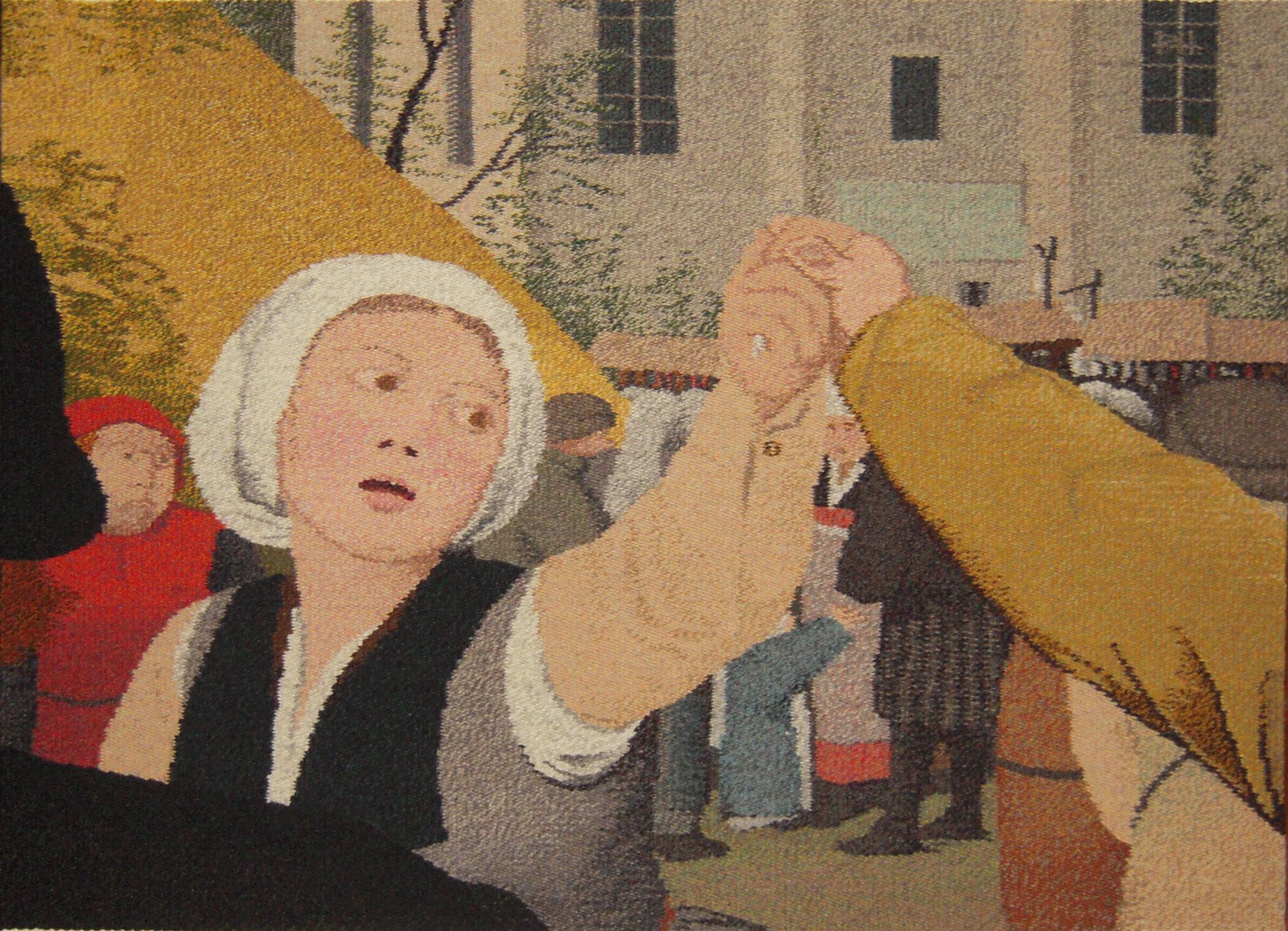
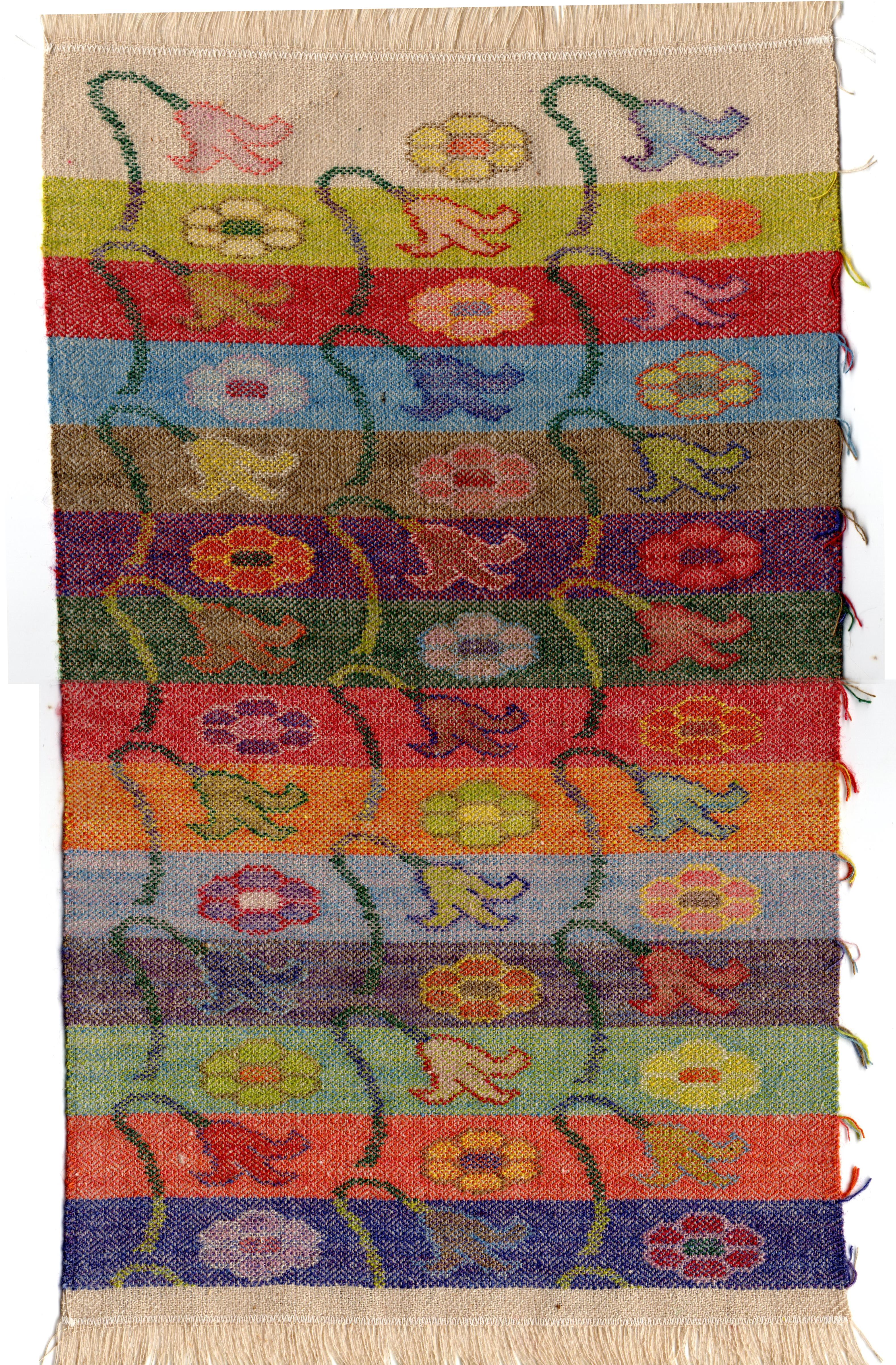
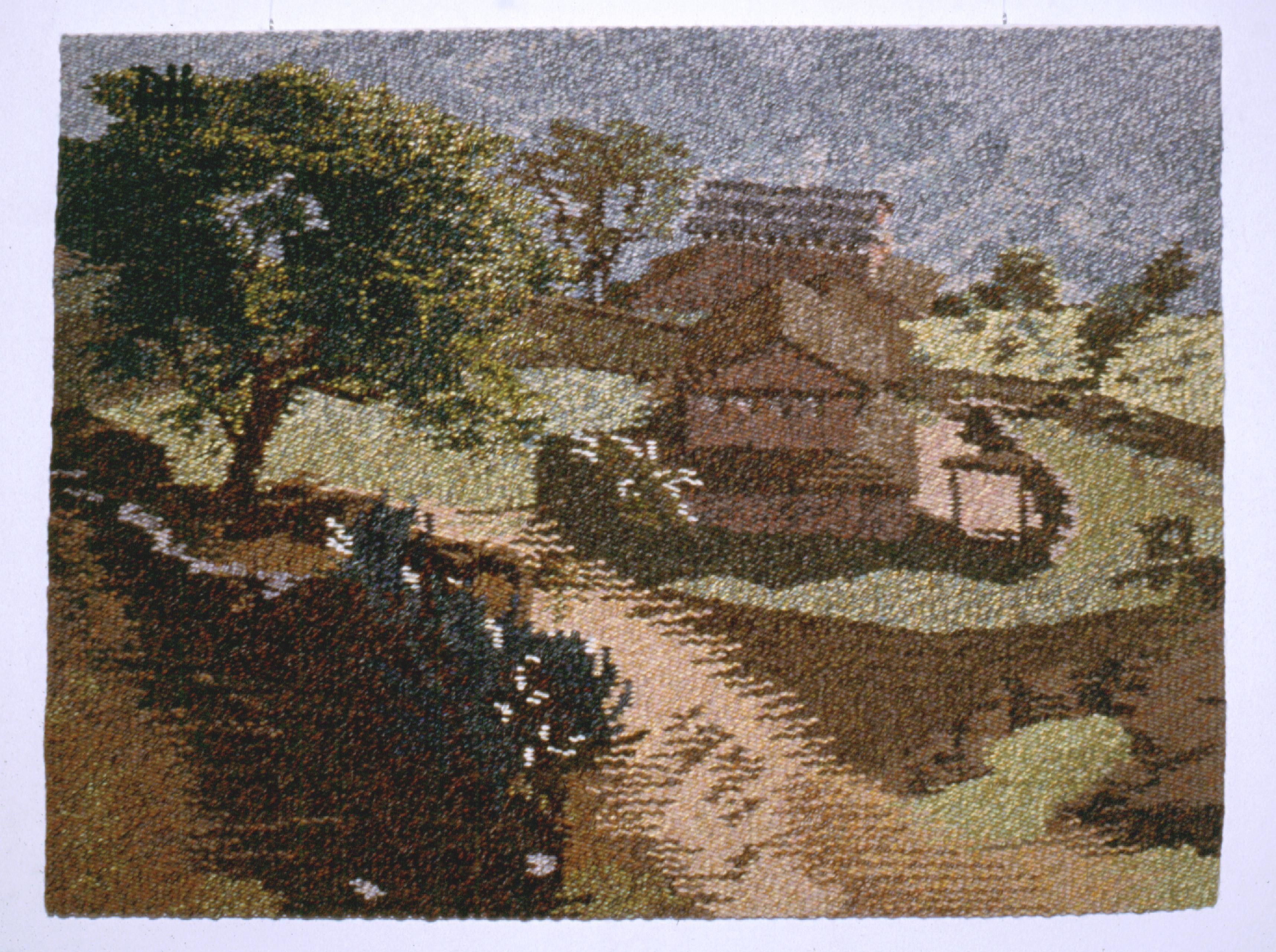
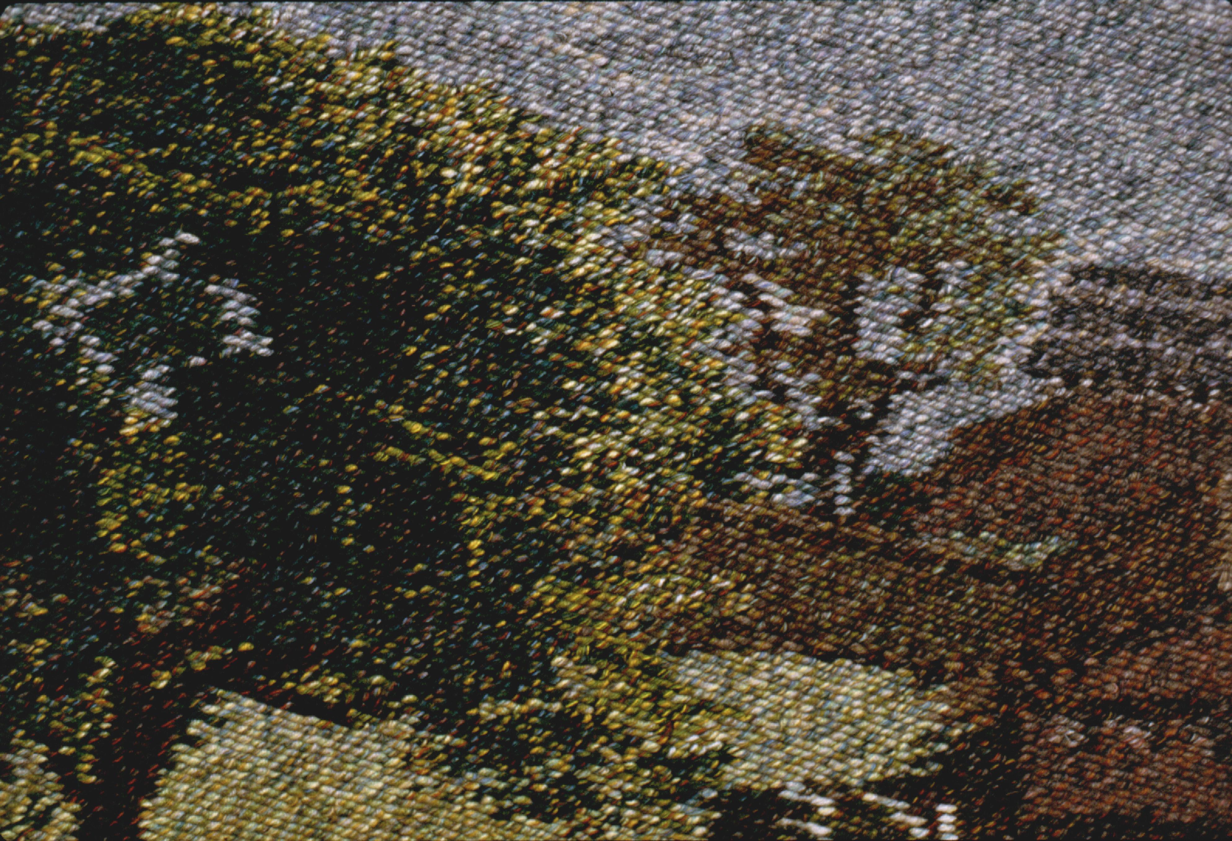
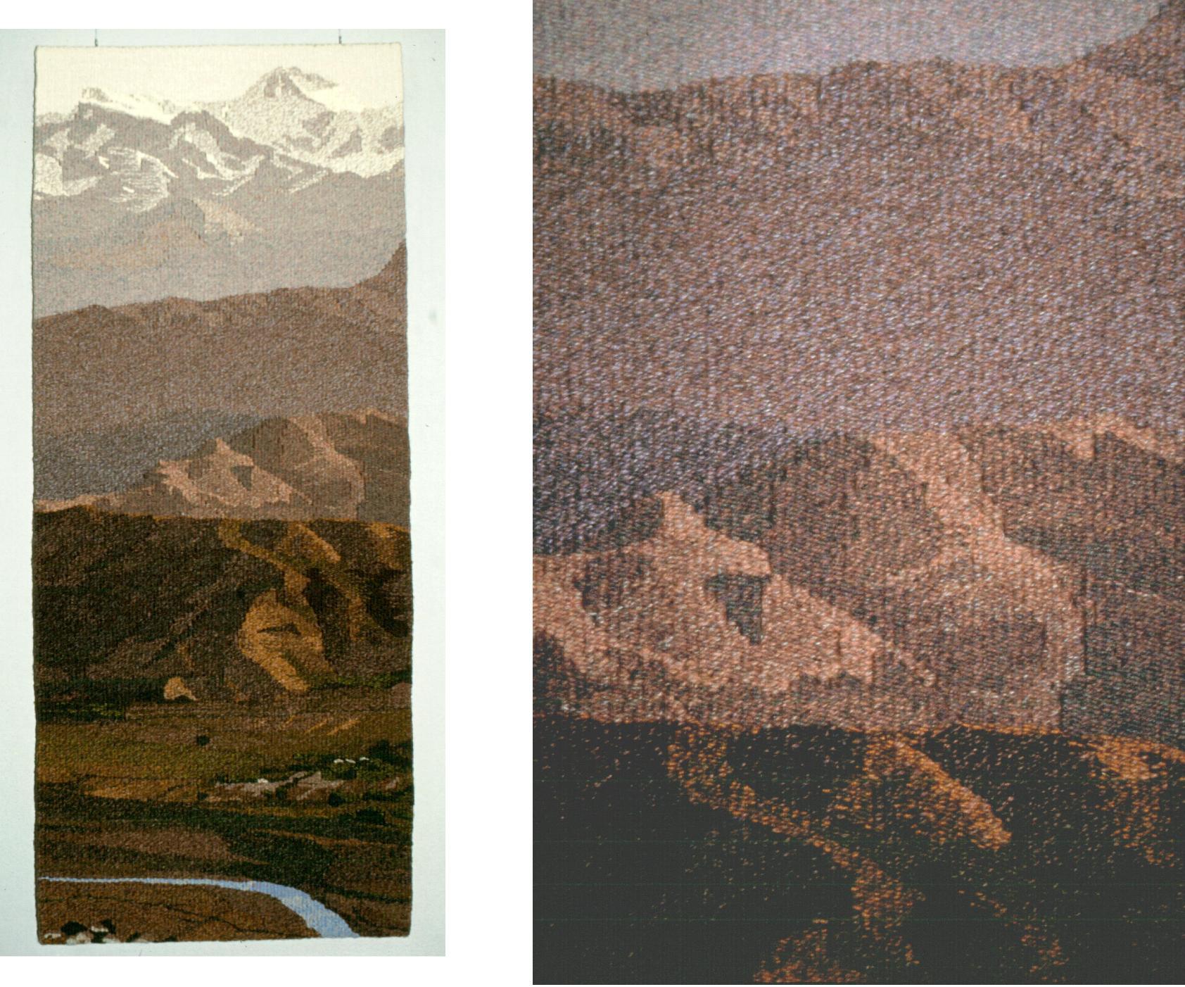
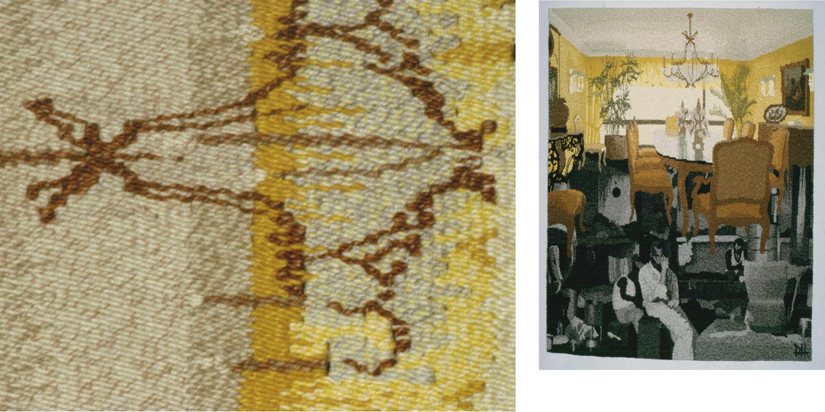
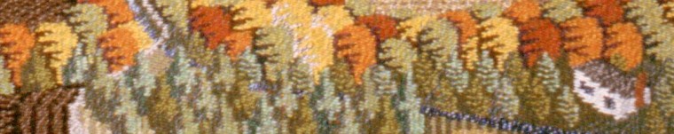
Details displayed in this post are from a fabric woven at the School of Designs in Srinagar, Kashmir, from an existing set of talim re-assembled by the author, with revisions by the weaver I discovered through this process.

Mapping old Kashmir shawl designs using carpet CAD software

•18/09/2024 • Leave a Comment

Any antique kani-woven fabric that I am lucky enough to see in sufficient detail in published photographs, shows signs of being woven according to the formula of two picks of weaving for each line of talim instructions. This would correspond to old talim pages showing a “half” nal added to the beginning and end of every second line of text. The modern practice is to weave four picks to each talim line, strongly influenced by the availability of carpet design software which represents each knot on a square grid. For shawlweaving it can be interpreted as each nal woven in the four picks required to complete the 2/2 twill weave unit. That way, the next row of nals is placed in square-grid alignment, above the previous row. The result of this is a visibly more coarse and unfocussed appearance of the design in weaving. As well, the designs in antique fabrics and old talim cannot be exactly duplicated.
One of my earliest realizations was that a “brick” grid of suitable proportions could be used to represent two-picks-per-talim-line information corresponding to the detail I see in antique fabrics, and to explain the placement of those talim lines with half nals. In the early 1990’s, I was using prepared graph-paper and felt-tip markers to discover credible likenesses in random pages of talim. At about the same time that the commercial usefulness of CAD for carpet design was being recognized, the weaver Ingrid Boesel showed me a “grid-based ‘paint’ program” called Stitch Painter that provides a brick grid with all the on-screen advantages of formatting and correctability. It even provides a count of the colours in each row, similar to the talim, except that it uses western letters and numbers, and the half-nals need to be added by hand. Carpet CAD programs may use the short-hand numbers and symbols of the shawl alphabet, and employ half-units in mirror-reversed designs, but do they have the brick grid?
Recently I was asked to double the scale of a detailed buta design from an antique fabric that I was copying – double the number of nals and picks of weaving. I remembered seeing a programmer’s explanation that each unit of the brick grid combines the data for two side-by-side square-grid units. (Similarly a “half-drop” grid combines the data for pairs of square-grid units one-above-the-other.) In Stitch Painter I could toggle between the brick-grid view as I had drafted it from the fabric, and the square-grid view showing each brick divided into its square-grid twins. To double the scale, each square-grid unit now represented one nal in width and four picks of weaving instead of two picks. If I wanted to weave by the four-picks-per-talim-line method, I could read my talim instructions directly from the square-grid diagram. But that is not what I want to advocate.
Designers with access to carpet CAD programs can begin to unlock the designs in fabrics or talim based on the two-picks-per-talim-line method if they allow twice as many grid-units in width for the expected number of nals, and then always colour-in those grid units two-at-a-time. It requires doing by eye what a brick-grid-capable program provides, but it is still possible with more commonly available square-grid-based programs.
Combine side-by-side square units in pairs as a brick representing one nal woven in two picks. The next row of units combine to show the bricks overlapping by half. The third row of bricks aligns vertically with the first row. In other words, two rows of bricks account for – and give somewhat the appearance of – the four picks of weaving that it takes to repeat the 2/2 twill weave-unit. Note that no space is given to represent the warp colour, which is understood to be present throughout, as if it were the lines of the grid.
The isolated square units at both ends of the same row usually combine to form one brick or nal of the same colour, at the point where the pattern repeats. Individual square units can also be used to represent “half” nal notations within talim lines, a sign of extremely fine detail and another level of difficulty for the weaver.
Being prompted to double the scale of the design reminded me of the principle that the aim of the on-screen design is to resemble the end result, to enable the designer to visualize and improve it. How to apply it to weaving depends on how the weaver – or bead-weaver or embroiderer – translates it with his or her usual practices. Two picks or four, nals stacked or staggered – the grid-units can be interpreted as needed.
Though it looks similar, the modern practice of square-grid designing and four-picks-per-talim-line weaving is incompatible with the old designs – too many picks extends the design lengthwise, or else only half as many grid-units are available to represent details.
Fresh designing on a brick grid is more flexible and subtle than on a square grid, and new instructions for each two picks of weaving doubles the resolution of the design in the lengthwise direction – the easy direction. To add more details in the sequence of each talim line – more bobbins – that’s the hard way.
I keep saying: Yes, there are twice as many lines of instructions, but the number of picks of weaving is the same. Add to that, the number of bobbins in use is the same because chances are that the same bobbins will be used in the second line of instructions, just slightly differently to give better shape of a detail, or smoothness of line.
When I discovered it for myself, I wanted to share this work-around that would allow the drafting of two-picks-per-talim-line designs using square-grid carpet CAD software. Somewhere, there are admired antique fabrics with no documentation, and treasured old talim papers with dimly-remembered designs or hidden problems. These should not be given up for lost, or unrepeatable.

Next: mapping designs from antique kani fabrics.

Trapped in a Bruegel painting

•27/06/2024 • Leave a Comment

For a year recently I was trying to imagine the life of Bruegel – or look over his shoulder like the companion figure in a supposed self-portrait. Not much is known so the bare outlines seem familiar: in mid-16th-century where is now Belgium, a youth probably noticed for his talent, a successful apprenticeship in an artist’s studio in Antwerp, toured to sights and studios in France and Italy, worked early on designs for engraved prints (you might say calendar art) and later on paintings as he gained recognition, married his apprenticeship-master’s daughter, set up shop in Brussels, died mid-career in his 40’s.
For an artist whose work was collected during his lifetime, his surviving oeuvre is surprisingly small, and shows him turning to several popular genres – landscapes, Classical and Biblical stories, months, caricatures of everyday life. “The Village Kermis” (a fair in support of the local church) also known as “The Peasant Dance” that my tapestry project is taken from, is one of just two or three paintings, from the last years of his life, with eye-level perspective and “monumental Italianate” figures. I picked it for the volumes and gestures of its figures, the magnified three-dimensionality of the space, and the open face of the young woman.
I noticed that of the hundreds of faces that Bruegel has drawn, almost all are turned away from the viewer, engaged by whatever interaction in the painting, portrayed with irrepressible satire. More than that, it’s a black-and-white mix of detailed drawings that suggest real people, and vague sketches just meant to convey a reaction. The young woman in my tapestry is one of only two or three front-facing portraits I’ve found, where you might think the person was looking back, even accidentally, from the painting. Another looks out from “Haymaking”, and in “The Peasant and the Bird-nester”, the look is part of the narrative.
Tapestryweaving was a recognized trade at the time – Bruegel would have been familiar with the opportunity to design for tapestry, and was given a commission for a set of designs late in his life, but there are no remaining tapestries or designs attributed to him. A tapestry designer was expected to prepare actual-size, painted “cartoons”. The setting of that novel “The Lady and the Unicorn” by Tracy Chevalier, about the commissioning of a set of tapestries, is 60 or 70 years earlier, “end of the 15th century”.
I have long felt that Bruegel’s paintings made excellent tapestry cartoons because of their story-telling, and space-filling detail. Compared with a photograph, I get the advantage of the painter having composed the scene of purposeful details, and I get the obligation to him that everything is important. It helps me hugely to be able to identify and visualize every object, to go on to represent it in another version. I was lucky to find close-up photography available at insidebruegel.net.
Bruegel’s early work designing for printmaking was based on his drawing skill, and it literally shows through in his painting, in a style that is problematic for a tapestryweaver, not only positioning the stitches of the artist’s line exactly right, but also weaving up to them on both sides with the background wefts. Arguably, my habitual style of tapestryweaving using a coarse sett (2 or 3 warps per cm.) and wefts of mixed colours is more like the fat brushstrokes of the impressionist or pointillist painters. So I have to decide which outlines need to be there for emphasis, and what can be suggested by other means such as shading the edges, or simply contrast control.

Bruegel is sometimes called a miniaturist. The portion of his painting that I am copying is about the size of a large postcard, the young woman’s face the size of a thumbprint. At the scale I’m weaving (48 inches wide), her face is a larger-than-life-size presence, but other details range down to smaller than I can represent – even something obvious as an eyebrow can go from surprise to skepticism in a couple of stitches.
Ironically, there is a question sitting right in the spotlight: What is the young woman holding in her hand? The hand-clasp with her dancing-partner is one of the focal points of my composition, and there is a bright highlight below her little finger that can’t be overlooked. Is her thumb resting against the top end of the same object? A handkerchief? A rosary? A bobbin? Or is it part of a vine wedged into an angle of the church wall in the background? And why is the skin tone of her hand so much darker than his? Is she a dyer?
Nevermind the anatomical difficulties also present. A friend objected that her curled fingertips should point toward her wrist, and her index finger (if that’s what it is) is probably dislocated. Some other Bruegel people show signs of being patched together from separate life-drawing studies.
As a tapestryweaver I have ample time to wonder, What is that object and its significance? as I am working my way up to it. It’s not only a challenge but also a responsibility not to de-emphasize or misinterpret some detail that might be important. I assumed from first sight that the background figure at the peak of the arch formed by the two upraised arms, is the village priest, wearing a surplice and mitre. In discussion with a friend, she assumed it was a woman wearing an apron and headcloth. The clothing appears to be open at the neck, showing skin-tone in shadow, where I would expect the priest to be wearing a collared shirt. This appears to be one of those cases where to colour it right for one interpretation will be wrong for the other. Days ago, I opted for my best judgement of the paint colour, but, tapestryweaving being what it is, I’ve been engaged in other parts of the advancing edge, so it’s not too late to change my mind…
…For the last couple of weeks I have been struggling to get the best expression of the young woman’s eyes in my tapestry, not unexpectedly, but it’s difficult because the face is tilted, the range of tones used is very limited, and her expression is ambiguous – I think, or I want it to be so. I think I’m getting close. As I un-weave my way back to something I have to fix, I just hope I remember the bits I want to repeat same as before…

Mughal patka weaving

•12/05/2024 • Leave a Comment

I first wanted to undertake this study of “brocade” weaving after encountering it as a kind of cheating in the weaving of twill-tapestry Kashmir shawls: instead of having a dedicated weft at every colour-change along the pick where one is needed, one weft may skip to several nearby places where the same colour is required, in order to keep down the number of weft bobbins in play. Because this tactic needs to be repeated in every pick, floats quickly build up and can distort the fabric, so it’s a bad practice, but nevertheless dignified by the name “spot brocade”, according to my mentor Grace Beardsley.
“Brocade” is a word like “tapestry” that many people know a little about what it looks like, but not about how it’s made. Brocade starts off being a loom-woven fabric of a uniform appearance, then the regular repetition of the weave structure is interrupted by the representation of a visual design, using additional wefts that accompany or replace the background weft, to appear on the front where they are needed. These additional wefts may run from selvedge to selvedge by shuttle, or may be inserted in places by hand using bobbins. Because they are only displayed part of the time on the front, masses of floats can accumulate on the back of the fabric, that need to be contained in some way to prevent snagging, or cut away.
I have the benefit of Rahul Jain’s documentation of patkas in the collection of the Calico Museum (Jain, Rahul. “Mughal Patkas, Ashavali Saris, and Indo-Iranian Metal-ground Fragments in the Collections of the Calico Museum of Textiles and the Sarabhai Foundation”, Ahmedabad, India, 2008), that I acquired by mistake, hoping twill-tapestry technique would be included. Patkas and Kashmir long shawls share the same boxes-within-boxes format of field, featured end-panels, and side- and cross-borders, and the same prompting from their Mughal patrons to show off their most intricate work and to portray their favourite flowers. But while twill-tapestry relies on step-by-step, pick-by-pick instructions and complex hand manipulations, other types of patka weaving use the individual warp thread lifts of the drawloom – or jacquard, for that matter – to combine weave structure and pattern information for the passage of each shuttle or bobbin.

I became fascinated with what Rahul Jain categorized as a Type 1 patka which displayed the simple logic of a complex process: a double-cloth structure where two layers are woven-up simultaneously, and patterning results from swapping the front weft with a contrasting weft from the back layer. Being a relatively inexperienced loom-weaver, it was reassuring that the weave structures of the individual layers were simple and familiar – the front, 1/3 twill, for the predominance of pattern wefts in the front view; and the back, plain weave, providing some stiffening and a tidy back view.

For this small sample, I knew that I could improvise a shed-changing arrangement on a portable frame loom, but I did not have anything that would serve as a drawloom harness to lift individual warps. I needed 4 shafts for the 1/3 twill and 2 shafts for the plain weave, provided by catching each warp in a continuous looping of thread around each dowel – a “lifting” shaft where the warps are only held in order by warp-tension and previous treadlings. No reed – just a tapestryweaver’s comb for a beater. I placed the 2 shafts for the plainweave layer at the front of the harness, hoping to make it easier to get a clear shed with so many warps switching places.
Instead of lifted warps presenting a ready-made shed for each pattern weft, I expected to hand-pick my pattern in digital increments using the one-in-four raised warps of each 1/3 twill treadling as my grid-lines. An early and long-unanswered question was whether the weaving proceeds front or back side up – apparently the correct answer is back side up. (That doesn’t explain why the twill grain rises to the right on the front, while in Kashmir shawl weaving from the back, the twill grain always ends up rising to the left on the front.) I realised hand-picking pattern accurately would require constant hair-splitting, and decided to work from the front – no need to stand on my head as well, to do it. But I discovered how helpful it was to flip the frame loom over to tease out the shed of the back layer.
The typical patka is woven of fine silk threads, for a multitude of functional as well as decorative reasons. Nevertheless, I worked with wool threads, 1/8 singles, at hand in a wide range of colours. I had some experience weaving with them at about 20 threads to the inch, so I thought: front layer…back layer…they don’t have to pass through each other, they just occasionally get stitched together…make the sett 40 threads to the inch. I didn’t reckon on the two sets of warps having to slip by each other to raise a shed. I should have started over and relaxed the sett, but I persisted and struggled with it weaving up too fast, elongating the pattern of a motif meant to be circular. I switched to some very fine merino knitting yarns for my substituting and supplementary pattern wefts, that reduced the take-up slightly in the plain-weave layer.
Once I had established a heading, I wove up the two layers separately in an alternation of single or double picks. A 1/3 twill treadling of the front layer presents easily, face up on the loom. Then, to switch to the corresponding back-layer treadling, I secure all loose ends, flip the frame over, and tease out the shed.

To weave picks that include pattern, I first pick the path of the front layer background weft – it travels from selvedge to selvedge most of the way visible under the single 1/3 twill tie-down warps, but occasionally dips down through the web to form a float under everything when it’s displaced by a pattern weft. The front-layer background weft often features zari thread for an extravagant cloth-of-gold effect – not only shows off to the max but helps to preserve the fragile metal-wrapped thread with minimal turn-backs and deflections from its straight path.
Starting with the appropriate 1/3 treadling, I put a strip of card stock in to retain the shed. I use a pointed shedding-stick to collect the segments of the shed that the weft will travel, alternately under the tie-down warps, and under all warps. I use a bodkin to select the places where the weft will dip down and return. When I have the complete pick collected on the shedding stick, I can remove the card, open the shed and pass the weft shuttle.

Next, I need to pick the path of the back-layer weft, which travels selvedge to selvedge in the plain-weave shed of the back layer, occasionally appearing as pattern weft on the front. I treadle the back layer shed, flip the frame over, patiently clear the shed, and put a strip of card stock in to retain it. Then again from the front, I treadle the same 1/3 treadling as before, and retain it with another strip of card stock. I use the shedding stick and bodkin to alternate between under all the warps that are lying over the back-shed strip of cardboard, and under only the front tie-down warps. When I have the complete pick collected on the shedding stick, I can remove both cards, open the shed and pass the weft shuttle.
In portions of the pick to be filled by additional (“discontinuous”) wefts not part of the back layer, the front background weft shifts to float on the back, but the back-layer weft stays in its shed unless it is part of the patterning. In theory all occurrances of the same colour weft in the pick would be woven at once by shuttle; in practice I insert colours in succession to cross an area of patterning such as the leaf or flower petals. Only one bobbin of each colour may be enough to span a motif, but another one strategically placed may help to reduce floats. Interlocking is not required – by the next pick the additional wefts are anchored by – and helping to tie-down – the intervening background weft floating across the back.

Where am I getting, and how am I applying, my design instructions? Fortunately I had previously worked out a draft of the floral sprig, in a digital format based on counting units in each row from side to side. These correspond to “weave-units” of the 1/3 twill, which are marked by the tie-down warps of the current treadling. The weave unit of 1/3 twill includes 4 warps and 4 picks, and is essentially square in aspect-ratio – each row of a design on a square grid would be woven the same in 4 picks. In the design I am using on a brick grid, each pick is woven the same twice, and the placement of the next row of grid units represents the shift of the stitches of weft, 2 treadlings later.
I discovered these correspondences because of my experience with Kashmir shawl weaving, all due to the 4 by 4 size of the weave unit and the straight twill progression in the treadling, whether it’s under-two-over-two or under-one-over-three. Working in 4’s is made-to-order for the 4-shaft counterbalance harness, ubiquitous in Kashmir and wherever 4 shafts is enough. Fours also have a close working relationship with 2’s and the reciprocal movement of left-to-right and right to left. For all warps to be attached to one of only four groups allows little scope to produce brocade imagery, thus the need for handwork and detailed instructions. On the other hand the drawloom or jacquard with its individual warp lifts is just giving the appearance of twill weave – it could be any structure that facilitates the substitution of coloured wefts.

I found the work routine tedious and fussy in ways less rewarding than twill-tapestry shawlweaving, where wefts connect in sequence and counting errors give themselves away at the end of the pick. This brocade weaving with the pattern hand-picked, requires selecting an opening at each point the weft appears and disappears, and has a way of revealing mistakes further back than I want to go, to correct them. At best it’s a process of multiple steps to accomplish each complete pick.

In that spirit I wondered if the front-layer background weft could be woven into the back layer when it’s displaced by patterning, instead of left to float freely on the back. It just requires the same combination of treadlings as for the back-layer weft used for patterning, producing something even more like a true double-cloth.

It would seem possible to make creative use of this method of hand-picking pattern, from a pictorial design or from an image firmly in mind, as in tapestryweaving. Because the back layer weft is always present as a potential pattern weft, there’s no worry about needing to introduce additional bobbins to represent awkwardly placed details. A brocade design of only two colours can be infinitely detailed but composed of only two weft threads. Conversely, a tapestry design can be only two colours and still require an additional weft at every colour-change along the pick.
By weaving a sample, I wanted not only to see if this alternation of pattern and background wefts worked, but to inhabit the structure, lay out the path for the weft to follow… The shed that stands propped open one moment, is closed and locked by the next pick… Fabric is composed more of structure than of substance.

Chashm-i-bulbul, kani, and optical colour mixing

•12/04/2021 • Leave a Comment

Chashm-i-bulbul, kani, and optical colour mixing – three keyword searches that only converge here! Not wanting to waste or leave hanging the remainder of my warp with chashm-i-bulbul threading, and now in the presence of 12 colours of the same 1/20’s tussah silk yarn altogether, and three at any one place in the weaving, I determined to sample as many different combinations as possible.

The warp colour is a given and appears to some extent throughout. The natural/white silk tends to lighten and weaken the weft colours from a distance, and sparkle and break up colour effects close up. For a project, the colour could be chosen to blend more readily, or to highlight the chashm-i-bulbul pattern.

Also appearing throughout is the shuttle weft, alternating with each pick of the kani-woven wefts that define the design. The colour of the shuttle weft will contribute everywhere a bit less than the kani wefts, because of some tighter interlacements completing the chashm-i-bulbul pattern. The kani wefts, even the same thickness, always appear as stitches spanning two warps, floating a little more prominently. Many aspects of harmony and contrast can be considered in the choice of shuttle and kani-weft colours, especially in broad areas of kani-woven background. For my purpose this offered many opportunities to observe individual combinations, and the effect of the shuttle weft pervading each section of the sampler.

I used a design which I had previously devised as an example of a smallest-possible pattern-repeat for kani weaving, providing some vertical continuity and complexity in the off-set rows of repeats, and allowing any number of combinations in the flower outline and fill colours. Originally the size of the repeat was just 16 rows of 30 units on a brick grid, where each line of instructions is woven in two picks. I complained more recently that a detailed brick-grid design (2PPTL) in this technique when each line of instructions is woven only once, led to many awkwardly-parked wefts. I doubled the size of the design – twice the number of rows and units on the Stitch Painter grid – and edited. This allowed me to refine the design while ensuring that wefts making long horizontal passages could return in the next line.

Each row of pattern repeats – each colour-way of the sampler – follows 32 lines of instructions alternating with 32 picks of the shuttle weft. The chashm-i-bulbul weave pattern repeats on a cycle of 20 treadlings, so after working through 10 lines of kani instructions. The difference between these two cycles has no effect on the design, because the kani stitches are always appearing on the same opposite pairs of warps, in a brick-grid arrangement. On my pages of 64 numbered lines of kani instructions (2 rows of design repeats, including the off-set), every 10 lines signals a new treadling cycle, so it is always possible to re-establish where you are in the treadling sequence, something easy to lose track of when plain shuttle-weaving is interrupted.

I found that the chashm-i-bulbul pattern shows up most clearly on the light warp if the shuttle weft and the kani background weft are both relatively dark: the same colour, or a mixture of similar light/dark value – the resulting hue is another question. Too much difference in value between the two wefts, and the pattern disappears. If the kani weft colour is too prominent, it will show as a brick-grid arrangement of stitches. If the shuttle weft is too prominent, like the dark red in the 7th section, it can just look like a salt-and-pepper texture.

This key to the entire sampler shows the colours used as kani wefts, with the shuttle weft colours at the margins. Each section of the sampler began with the choices of colours for the shuttle weft and kani background weft, where the weave pattern would be most evident. I considered variety and contrast with preceding sections, to maintain my own interest. My colour combinations for flowers are somewhat naturalistic, though I only thought specifically of poppies and bluebells. Each of the three flowers in that section was a separate experiment with the underlying shuttle weft and surrounding background. I was always trying to make it show up clearly, by using light/dark contrast or complementary colours. Darker outlines seem sharper, but it’s surprising how effectively a light flower covers a darker shuttle weft. Often a combination I saw a little of in a flower petal, became the background expanse in a later section.

My purpose in using all threads of the same thickness is to represent fairly the effect of this novel weave structure on the intensity of the design compared with an entirely kani-woven structure. The sampler fabric finished up a little more weft-predominant than intended: 70 wefts to the inch compared with 50 warps, something that favours the intensity of the design, but not the proportions. Earlier samples in this project with thicker kani wefts showed the design to good effect, but hid the chashm-i-bulbul pattern. Many good choices to be made.

Chashm-i-bulbul and kani weaving samples

•22/12/2020 • Leave a Comment

The dimensions of this project were chosen simply to provide scope for sampling. I could foresee that if I wanted a width of 100 2-up-2-down stitches, or grid units of design, it required 400 warp ends, of a length that was generous but not wasteful.

I started with an abundance of tussah silk 1/20’s singles yarn in natural white, so much so that I wound off the warp 4-at-a-time, a set-up for unexplainable tangles later on. The silk had thicks and thins but seemed reliably strong, with enough texture to hold wefts in place. Threading the heddles on 4 shafts, broken point twill 8 threads each way, then 2 per dent in the reed, was easy. I eventually settled on a metric reed 85 dents in 10 cm. (about 43 ends per inch).
Initially, all I had available for comparable-sized wefts were: a quantity of the same tussah silk previously dyed dark gold, enough that I sometimes used it for shuttle weft; small amounts of dyed pashmina wefts from an earlier project, that were on the thin side; and two sorts a bit thicker than the silk – a stash of very fine 2-ply knitting wool in a random choice of colours, and some 2-ply, matte, 80% silk remnants dyed for another project.

For Sample 1, my first after a couple of warp-density trials, I decided to use the pashmina wefts, because I used them before on a warp of the same tussah silk, for a full twill-tapestry sample, my best attempt to work at a scale approaching the 80 threads-per-inch standard of Kashmiri kani weaving. I chose a simple, easily-recognizeable floral sprig, previously copied not-to-scale from a printed photo of an antique fabric.
I have almost always copied motifs from antique shawl fabrics to illustrate my studies, trusting their appropriateness of style and technique, while indulging my uneducated taste. I would always prefer to copy stitch-for-stitch, but often I cannot see the fabric texture because of the limited resolution of the print or screen versions, so the talim instructions follow my most judicious draft of the design on a brick grid.
I made two colour-ways to sample mid-tone and contrasty colour schemes. In a fit of enthusiasm I mailed the blue-and-white version to a colleague in Srinagar, but he never received it.
As well as the warp, there are two sorts of background weft in this hybrid technique, one the shuttle weft appears throughout, the other the background portions of the design in the kani-woven picks. Where these two are the same and contrasting with the warp colour, the chashm-i-bulbul pattern shows readily.

The pashmina wefts were very fine handspun 2-ply’s from a Kashmiri women’s group, that showed a range of skills, thicknesses, evenness, and fragility. Anytime I found myself working with a thin spot in a tapestry weft at the same time trying to navigate critical design details, helped to explain the distracting irregularities I observed in antique fabrics that look like repairs or other needlework.

In Sample 2, two more copies of the same design, I determined to use thicker weft yarns to help the design show more clearly. The motif on the left uses the 80% silk yarns I mentioned and a brilliant white shiny silk; on the right, the wool yarns weren’t quite so disproportionately thick and provided a smoother finish.
It became clear that the stitches of coloured wefts present a simpler, brick-grid arrangement on opposite pairs of warp threads, that tends to obscure the underlying chashm-i-bulbul structure.
It’s surprising how well lighter colours cover the darker shuttle weft, but the white silk pops out excessively.
Because of the blending effect of so much background, similar colours like the two tones of leaf-fill in each copy merge together.

In Sample 3, I tried two colour-ways of another, more detailed small motif, using the same wool wefts. Again, it was a design drafted visually from a published photo, with typical outlines and panicles of identical small blossoms (a boon to the weaver).

Here is an opportunity to compare the same design – the same talim instructions – on the one hand rendered in the chashm-i-bulbul structure, and on the other woven in traditional kani technique, straight twill and 2-picks-per-talim-line.


Then in Sample 4, I wanted to see if I could work from a genuine Kashmiri talim, not from designs prepared by me. I was still using wool for the coloured wefts, but the same natural white tussah silk for background wefts as well as the warp.
As I worked through it, I became convinced that the “fine lines” style of this design was not perfectly suited to my application: because it was a two-picks-per-talim-line talim, in the present technique each line is only read once (the second pick is the shuttle pick), so a kani weft making a long traverse will more often end up in the “wrong” starting-place for the next instruction, adding to the floats and overlaps on the working side. And in the end, I felt that the chashm-i-bulbul pattern lost out because of both the thicker wool wefts in their brick-grid arrangement, and the white-on-white of the background areas.


So for my latest sample I dyed some of the same tussah silk yarn to use as my coloured wefts, and chose a design with broad patches of colour to try to view the loom pattern.
The design was drawn on square-grid paper from a published photo by someone for Kashmir Loom Company. At the time I worked on it, I was trying to prove that brick-grid designs (2-picks-per-talim-line) offered more clear and painterly renderings than square-grid designs (4-picks-per-talim-line). For that I was able to transfer the design to brick-grid on the computer and round-off the corners, but it is still basically a square-grid design with thicker outlines and “bigger” details. The advantage there is if the talim line is repeated L-to-R and R-to-L, each weft returns more-or-less to its starting-place, ready for the continuation of the design. Working my way along, I noticed and respected the designer’s own weaving experience for providing effective, reachable details and a balanced rate of complexity.

Now, in the last two samples I used the same white silk for shuttle weft as the warp, and I am still dissatisfied because it makes the loom pattern less visible and the kani design more pale. I would like to emphasize both, but not at the expense of the other, so for some more small samples I plan to go back to using a mid-tone shuttle weft with all threads the same thickness now that I have those left-overs of dyed silk. Weavers with more experience handling a wider range of threads and combinations for loom weaving, may get other ideas.

Chashm-i-bulbul and kani weaving

•05/12/2020 • 2 Comments

I have had an abiding interest in the question, What other weave patterns might be combined with talim-based tapestry designs? ever since I learned that representing these designs on a computer-screen grid was one thing and transferring them to weaving – or stitchery, or beadwork or knitting – was another. Kani weaving is traditionally done on what I know as straight 2/2 twill, on a 4-shaft counterbalance loom. Each weft pick is a regular succession of over-2-under-2 stitches, that can be represented by units on a grid, and given to the weaver as pick-by-pick, step-by-step instructions in the talim. In kani weaving, usually either 2 picks or 4 picks are woven to the same talim line. On the computer screen these two variations can be represented by a brick-grid or square-grid format, respectively. To refine my initial question: What weave patterns will provide a regular correspondence between the raised warps presented on the loom and the grid-units of the design instructions?

Early experiments were encouraging: I found undulating twill and broken twill patterns that could be worked on an existing 4-shaft, straight twill threading.


Each grid unit of design corresponded to the placement of stitches in each pick, but the difference in weave pattern was also visible.


Chashm-i-bulbul – “nightingale’s eye” – is a favourite traditional pattern in Kashmir for fine loom-woven shawl fabric. A kind of “bird’s-eye twill” of concentric diamond shapes, it is accomplished with a broken point-twill threading on 4 shafts and a reversing sequence in the treadling cycle. At first glance, the weaving draw-down presents varying numbers and groups of stitches in each pick, over and under 1 warp or 2… problematic to co-ordinate with a regular arrangement of design grid-units.

More recently looking again at the draw-down, I realised that every second pick was a regular over-2-under-2 succession of stitches – all the weave-pattern connections, the points on those little diamonds, were expressed in the alternate picks, that could be shuttle-woven. All in all, the grid-units of the tapestry design could be co-ordinated with the over-2-under-2 stitches, the alternate picks shuttle-woven as ground wefts, and the tapestry wefts passed over the intervening pick on the working side as they often are.

Chashm-i-bulbul is a balanced weave, the same number of warps and wefts per measurement. If each over-2-under-2 stitch, corresponds to one grid-unit or one nal of a traditional talim, then 4 picks altogether corresponds to one row of square-grid units or two rows of brick-grid units. Two of those picks are shuttle-woven background. So, a talim line ordinarily repeated in 4 picks is woven only twice, and a talim line in the 2-picks-per-talim-line format is woven only once – the return pick will be the next talim line.

The routine is much like simply weaving kani-style, except for the alternation of kani picks and shuttle picks. I’m using a chashm-i-bulbul treadling cycle of 20 picks, which I think of as 5 groups of 4 picks. In each group the first pick is kani wefts going L-to-R; second pick is a shuttle pick L-to-R; third pick is kani R-to-L; fourth pick is shuttle R-to-L. For the first pick I just have to choose a treadling that shows the warps 2-up-2-down; after that they will come up automatically.


So in each cycle of 20 picks, there is 10 picks of kani weaving – each pick different if it’s a brick-grid design or 5 talim lines woven twice each if it’s a square-grid design. Knowing where I am in the design makes it easier to not lose my place in the chashm-i-bulbul treadling. All those shuttle picks help to weave up faster, and make the fabric width more stable than if it were all tapestry.

Next time I’ll discuss my succession of samples that kept me company in the summer of the pandemic.

a rude waking

•09/11/2020 • 2 Comments
a rude waking

The idea for this piece was how shocking and unfair it is to be waked up and right away have to do something about it. And, having observed otherwise civilized cats at their sadistic play, how different would our relationship be if I was this size? Then there were the challenges of getting the depiction I wanted: a stare-down with the redoubtable Zorra, who was caught off-guard in “Triumph of…Whatever”; and a shot at the conceit of letting patterned drapery suggest the erstwhile sleeper underneath, with maximum foreshortening.
No doubt there are connections with other pieces in my oeuvre – the bad things happening, the extreme perspectives, the lying around in bed. Gary Larson was an early influence. I’m surprised how little it has to do with the last piece, maybe a respite.

Srinagar waterside

•21/06/2019 • 2 Comments

Srinagar, in the basin of a broad, flat valley – an ancient lake bottom – is a city threaded with waterways, defining urban settlement and marshy market gardens alike. Like railways they go against the grain of road traffic, running past people’s backyards more often than shopfronts, following their own exclusive right-of-way.  A first-time visitor in 1978, I fell under the spell of the unmotorized quiet and gliding passage of boats paddled or poled through the narrower channels.

That sense of separation from the vastly increased and modernized hubbub of road traffic and background events was still there when I photographed this scene on a winter afternoon in March 2012. The ordinariness of a run-down neighbourhood convenience store at a slack time of the day. with a few streamers hung up like a colourful marquee. I didn’t see any of the people in the picture, not then nor until after I decided to make the tapestry, didn’t think there might be something going on among some including an army picket, with others listening or trying to mind their own business. It happens sometimes, in the time it takes to weave a tapestry, that my understanding of parts of it changes.
The colourful streamers are a packaging innovation, strings of foil packets of snacks, sold for 5 or 10 rupees apiece. I had a habit of buying them from a friendly kiosk on the boardwalk to my hotel, so they belong in my nostalgia trip, and a reminder that things have a way of getting old before you know it.

optical colour mixing

•15/02/2019 • Leave a Comment

From my beginning days as a tapestryweaver, I appreciated the practice of combining various yarns in the weft to obtain exactly the hue and tone required. It appeared to follow the same familiar rules as for mixing paint colours, that all you require is three primary colours – red, yellow, and blue – with black and white for shades and tints. But the more experience I gained trying to weave pictorial subjects, the more I realized there were other phenomena at work – happening all the time, or prepared for particular effect.


Optical colour mixing is after all an optical illusion, and “connecting the dots” is a puzzle the brain is always trying to solve. The colours never actually mix if you peer closely enough, but if you pull back you get an impression of the colours combined, often somehow more lively, more vivid, than a patch of smooth colour.

A book that helped to illustrate for me in printed pages how this appears, is “Optical Color & Simultaneity” by Ellen Marx (Van Nostrand Reinhold; New York, 1983). It presents a lot of examples of colour effects and viewing exercises in the non-objective style of Johannes Itten’s illustrations.

In the history of painting, optical colour mixing was the basis for the technique called pointillism, where the component colours can be discerned in each dab of paint. This is like the individual stitches or “seeds” made by the weft, yet it’s so much easier using yarns, which never get muddied together, and the exact mixture and placement can always be reconsidered.
Many of the effects of colour mixing can be simply stated and understood, yet hard to measure or manage except by experience. Some of them can be important secondary cues to the perspective being established showing a landscape or three-dimensional space.

A weft composed of a wide range of lights and darks will have different effects than a similar overall hue composed of mid-value, harmonious, or heathery yarns. Wefts of a contrasty mix of bright hues will tend to advance, but wefts of mid-values and diffuse colour will tend to recede, compared to solid colours. Varieties of visual texture can be used for placement and emphasis, not just to imitate the texture of an object.

An increasing trace of light blue or grey evokes a landscape receding into the distance.


One yarn in common can link all the weft shades of an object or lighting situation. Often I must pause at a new stage in weaving a project, to compose a connected range of weft shades, adding and dropping the transitional colours. The number of changed yarns necessary to distinguish tone steps may vary depending on yarn similarities and contrast ranges within the mixtures.

A yarn in common can be used to suggest the effects of transparent layers, or cast shadows.

…notably not reflections, which are often unaffected by the colour of the reflective material.


A variety of transparent effects in foliage


Because there is no white paper baseline to compare colours in tapestry, and there is this uniform, tiled surface of stitches, neighbouring wefts strongly influence each other, but this may be hard to see at first. Compositional lines and shapes may only emerge from an arm’s-length reading of the differences among these stitches… or a look back after hours of work.


Interactions between colours known as simultaneous and complementary contrasts, can produce surprisingly vivid effects, a reminder that you should beware of producing them accidentally. It’s conventional wisdom that mixing complementaries in paint tends toward neutral gray, but in optical mixing, a trace of complementary hue brightens, not cancels, the predominant hue.


It’s ironic that I have found so much scope for combining yarns in tapestry, at the same time I have devoted so much study to Kashmir shawl weaving, a tapestry technique so fine that wefts can be only a single thread, and the designs are so thoroughly digitized that each weft stitch is specified one of usually a dozen or so colours. Instead, the hallmark of that tradition is design intricacy.


The most basic framework for organizing colours is the colour wheel or circle, with the three primaries yellow, red, and blue in tri-corner positions, the secondary colours orange, violet, and green ranged between them along with as many transitional hues as you have room for. For a colour course at the Ontario College of Art, I acquired a set of coloured papers that gave me a representation of the colour wheel in twelve steps, then for each step I prepared a screen that provides 50% coverage. This set of cards makes for a creative game of solitaire, observing the effects of complementary contrast, near-complementary interference… as well as ordinary colour mixing.

Here is a simple but surprisingly clear example, to view the effect of mixing adjacent hues. If I select a colour to simulate, and the two adjacent hues on each side, I have a range of five, enough to span from one primary to another. Leaving 3 alone, I exchange the screens between 2 and 4, also 1 and 5. They all give a somehow balanced impression of the colour of interest at 3; 2 and 4 are similar, convincing, and more vivid than 3; at 1 and 5 the more divergent hues and their light/dark contrast become more distracting (I learned to call this “razzle-dazzle” – the effect of yarn colours so contrasting, it’s more sparkle or noise than blending). In practice, there can be more than two yarns in the weft: highlights and accents of a range of hues and light/dark tones, probably anchored by the best available mid-range choice.

When it came to constructing colour wheels in weaving, the logic and progress of my study dictated that I consider any given yarn colour to be one of my “primaries”, a mixture of yarns in one weft a “secondary”… and a combination of more than one weft, by hachure for example, a “tertiary” mixture.
One of the first observations is that colour in wool yarns expresses the whole range of light and dark value native to pure hues, from yellow intense but very light, to violet approaching black. Arbitrary mixtures of these are likely to produce a lot of razzle-dazzle.

3 primary yarn colours


To address this, in a colour wheel composed of just three primaries, I selected yarns that were lighter (thus less intensity) so that value wouldn’t be a problem. Helped by that, they blend and transition smoothly from one to the other, with impressions of green, orange and mauve along the way.


The same 6 yarn colours in various mixtures

The same 12 yarn colours in various mixtures.

On the other hand, both six yarn colours and 12 yarn colours offered plenty of scope for blending intermediate hues, subject to the distractions of light/dark contrast, and the toning effects of colours too dissimilar. Each of 24 wefts consists of 12 single yarns of one colour or in fixed proportions such as 6+6 or 6+4+2.

4 primary yarn colours

Even just four “primary” colours is a big improvement on three. Of the four yarn colours, I chose the yellow-orange and yellow-green to blend more easily with darker hues. It was not very successful – the yellow-green yarn seems too yellow to blend well with the blue. The yellow-orange yarn is mistaken for yellow itself, while the mix of the two yarns makes for a darker mustardy or olive tone of yellow.


Perhaps my best insight was that my available yarn colours – all of them – are fixed and therefore “primary”, with connotations of both arbitrariness and resource. Drawing from a wide range of yarns offers multiplying combinations that can only be discovered and judged by eye. I’ve learned that light tints of various hues are the hardest to substitute, and that it’s useful to distinguish the faint hues of various grays.

The “experience” I keep citing as the way to gain control of these colour effects, is long but never in the sense of a programmatic apprenticeship or delayed gratification. The hours I spend weaving are all pure play anyway, but even more so when I’m sampling not in preparation for a bigger project, but to observe colour effects and relationships.

5 colour square sampler format

sampler for Annapurna