optical colour mixing
From my beginning days as a tapestryweaver, I appreciated the practice of combining various yarns in the weft to obtain exactly the hue and tone required. It appeared to follow the same familiar rules as for mixing paint colours, that all you require is three primary colours – red, yellow, and blue – with black and white for shades and tints. But the more experience I gained trying to weave pictorial subjects, the more I realized there were other phenomena at work – happening all the time, or prepared for particular effect.
Optical colour mixing is after all an optical illusion, and “connecting the dots” is a puzzle the brain is always trying to solve. The colours never actually mix if you peer closely enough, but if you pull back you get an impression of the colours combined, often somehow more lively, more vivid, than a patch of smooth colour.
A book that helped to illustrate for me in printed pages how this appears, is “Optical Color & Simultaneity” by Ellen Marx (Van Nostrand Reinhold; New York, 1983). It presents a lot of examples of colour effects and viewing exercises in the non-objective style of Johannes Itten’s illustrations.
In the history of painting, optical colour mixing was the basis for the technique called pointillism, where the component colours can be discerned in each dab of paint. This is like the individual stitches or “seeds” made by the weft, yet it’s so much easier using yarns, which never get muddied together, and the exact mixture and placement can always be reconsidered.
Many of the effects of colour mixing can be simply stated and understood, yet hard to measure or manage except by experience. Some of them can be important secondary cues to the perspective being established showing a landscape or three-dimensional space.
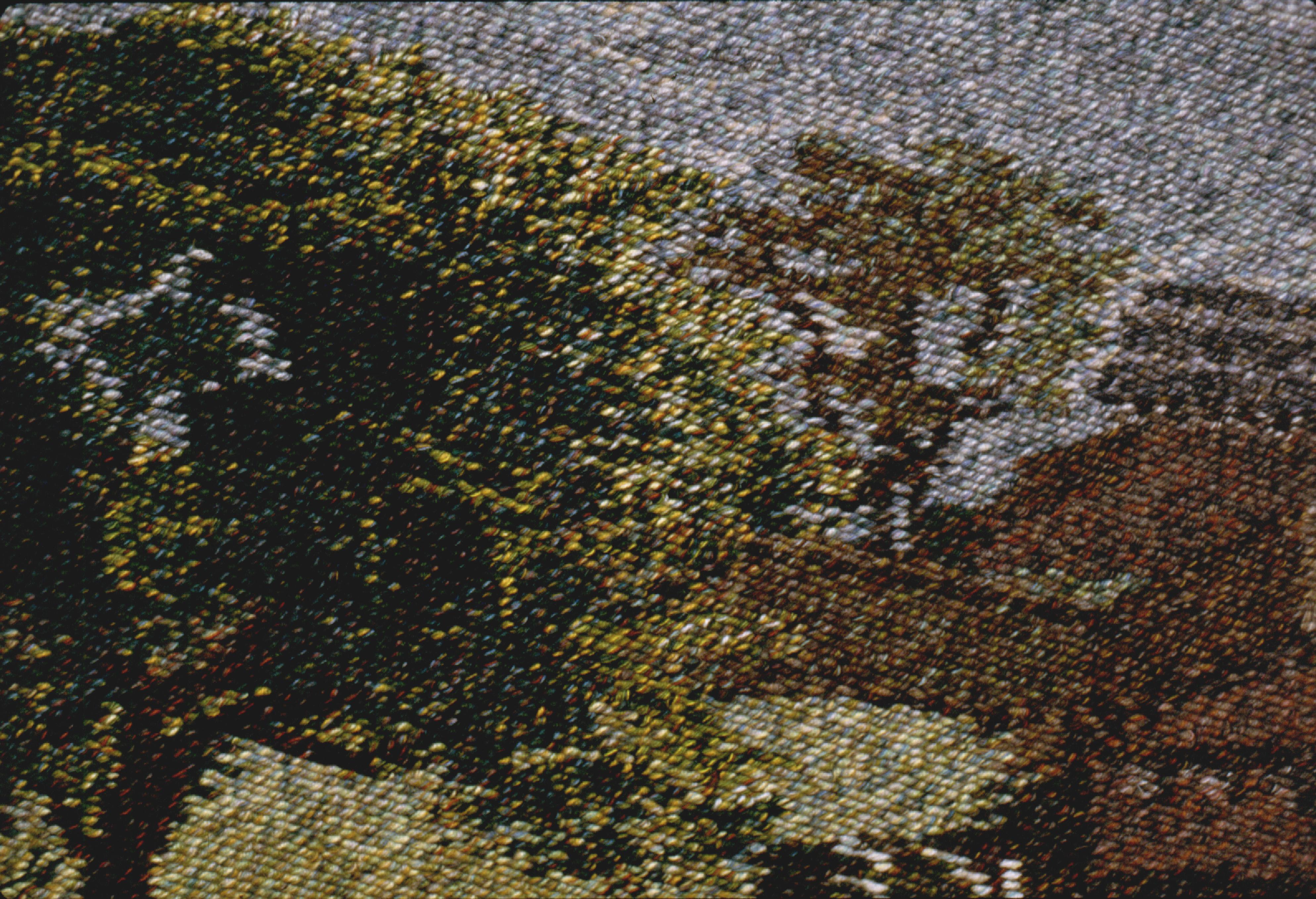
A weft composed of a wide range of lights and darks will have different effects than a similar overall hue composed of mid-value, harmonious, or heathery yarns. Wefts of a contrasty mix of bright hues will tend to advance, but wefts of mid-values and diffuse colour will tend to recede, compared to solid colours. Varieties of visual texture can be used for placement and emphasis, not just to imitate the texture of an object.
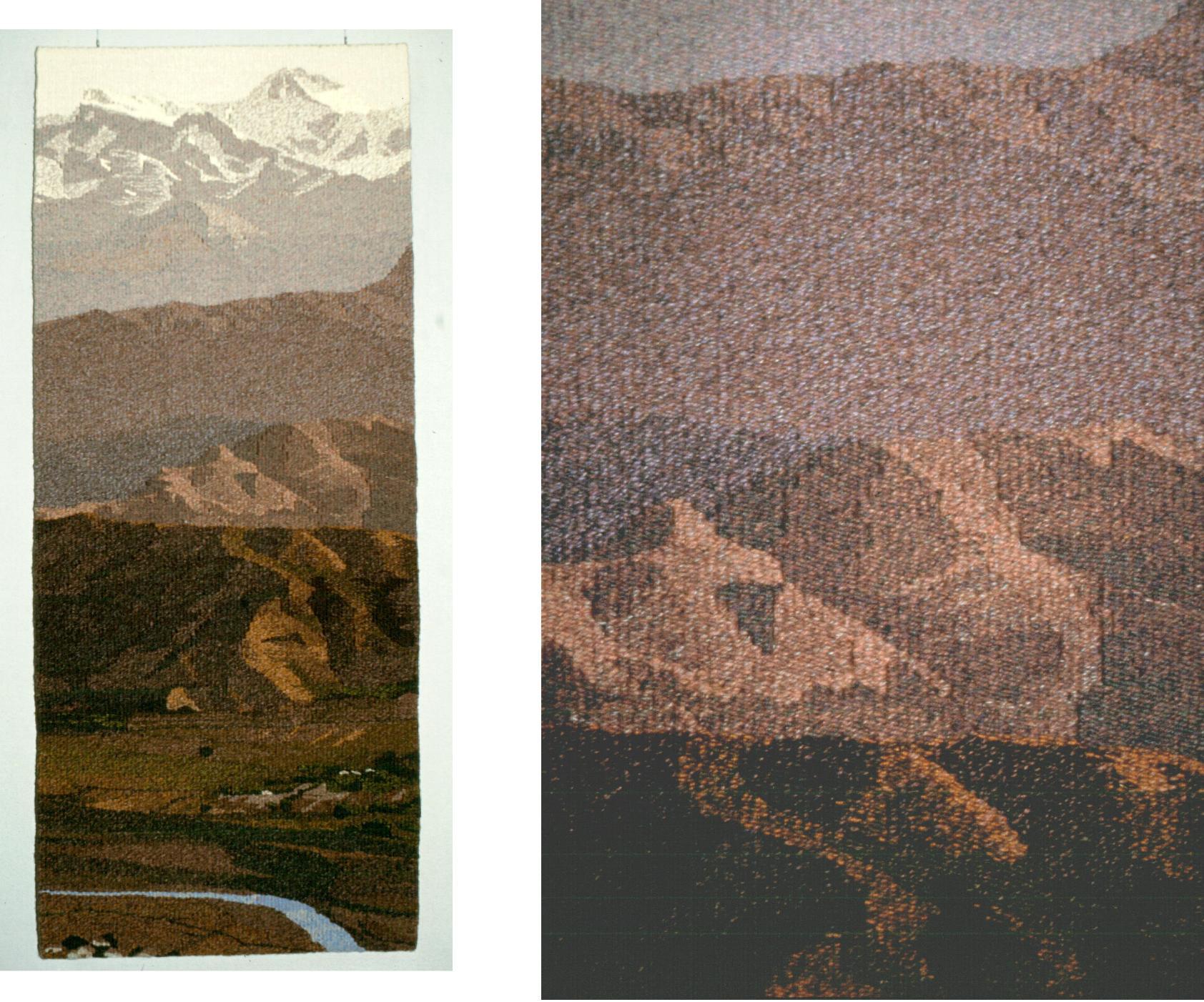
An increasing trace of light blue or grey evokes a landscape receding into the distance.
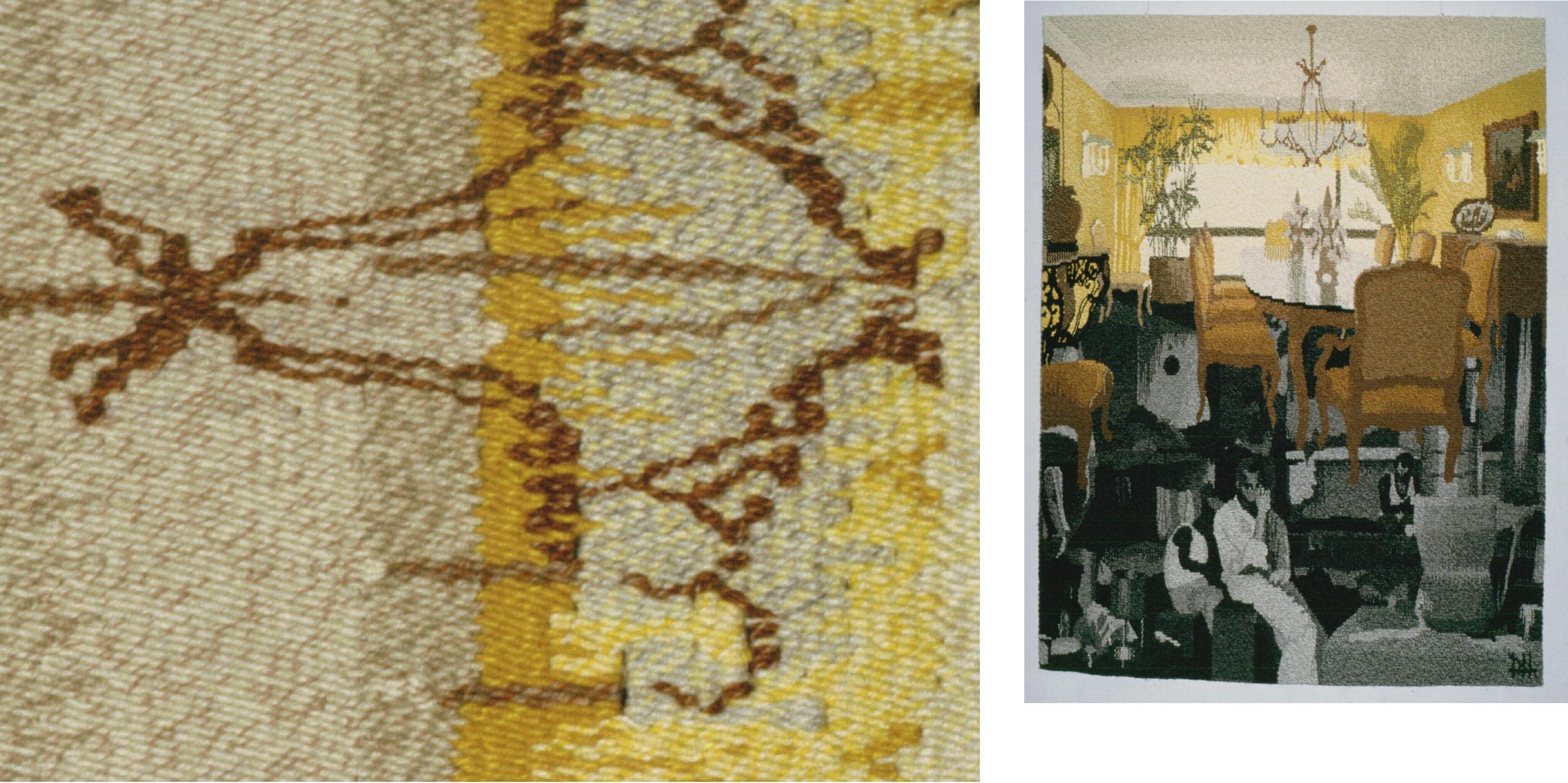
 One yarn in common can link all the weft shades of an object or lighting situation. Often I must pause at a new stage in weaving a project, to compose a connected range of weft shades, adding and dropping the transitional colours. The number of changed yarns necessary to distinguish tone steps may vary depending on yarn similarities and contrast ranges within the mixtures.
A yarn in common can be used to suggest the effects of transparent layers, or cast shadows.
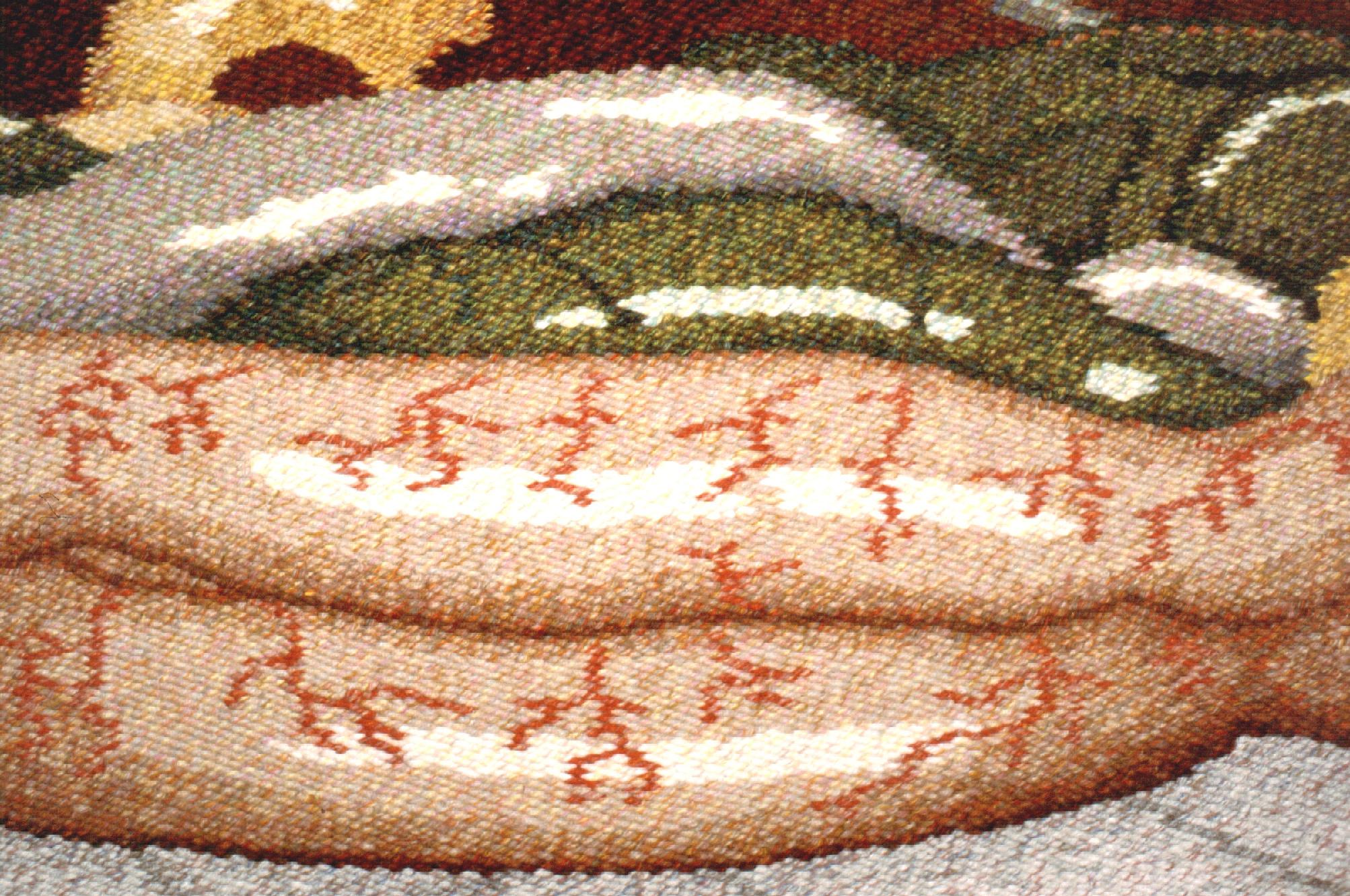
…notably not reflections, which are often unaffected by the colour of the reflective material.
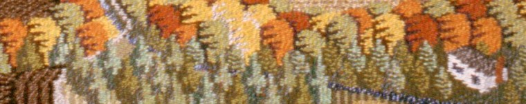
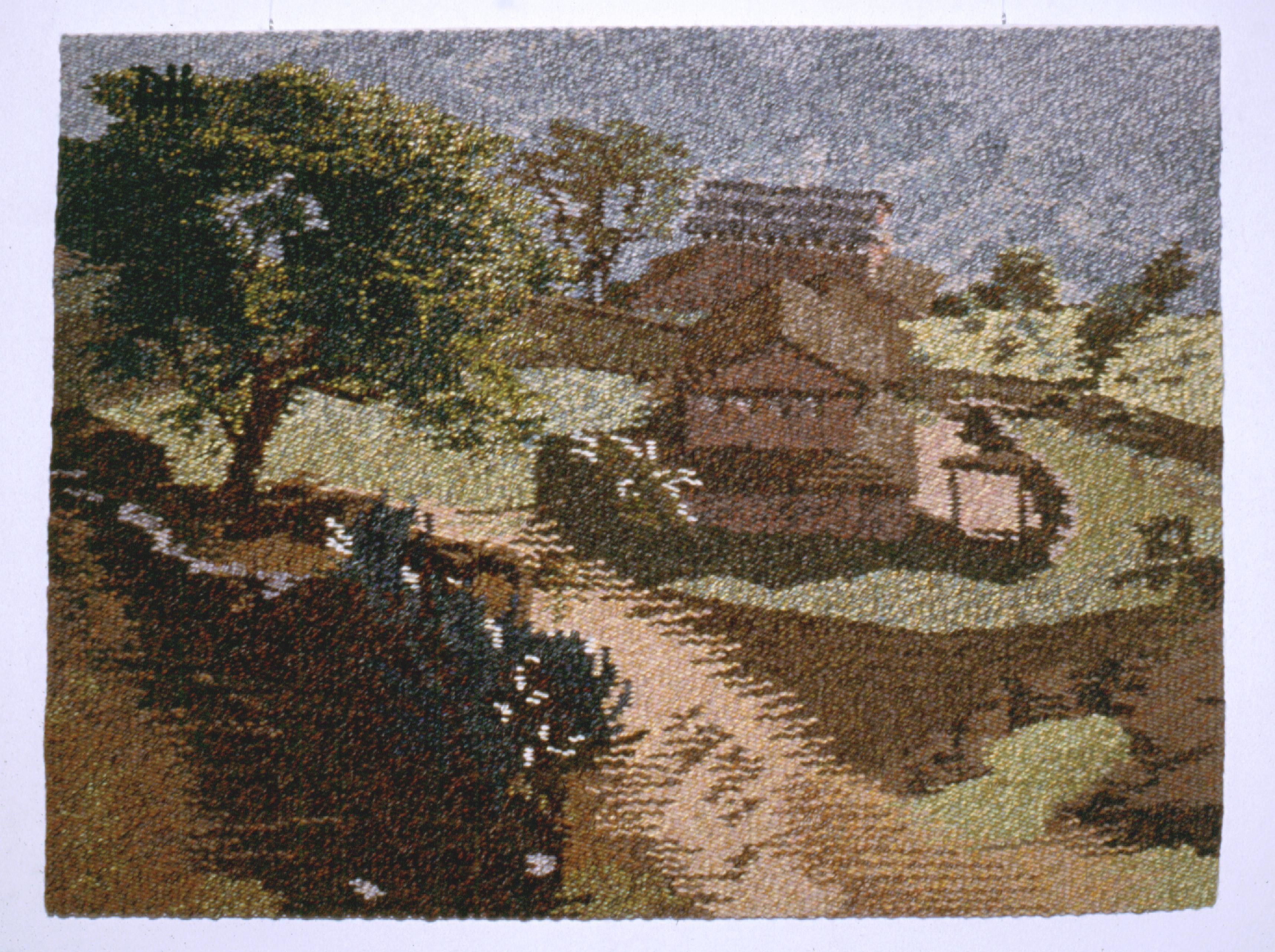
A variety of transparent effects in foliage
Because there is no white paper baseline to compare colours in tapestry, and there is this uniform, tiled surface of stitches, neighbouring wefts strongly influence each other, but this may be hard to see at first. Compositional lines and shapes may only emerge from an arm’s-length reading of the differences among these stitches… or a look back after hours of work.
Interactions between colours known as simultaneous and complementary contrasts, can produce surprisingly vivid effects, a reminder that you should beware of producing them accidentally. It’s conventional wisdom that mixing complementaries in paint tends toward neutral gray, but in optical mixing, a trace of complementary hue brightens, not cancels, the predominant hue.
It’s ironic that I have found so much scope for combining yarns in tapestry, at the same time I have devoted so much study to Kashmir shawl weaving, a tapestry technique so fine that wefts can be only a single thread, and the designs are so thoroughly digitized that each weft stitch is specified one of usually a dozen or so colours. Instead, the hallmark of that tradition is design intricacy.
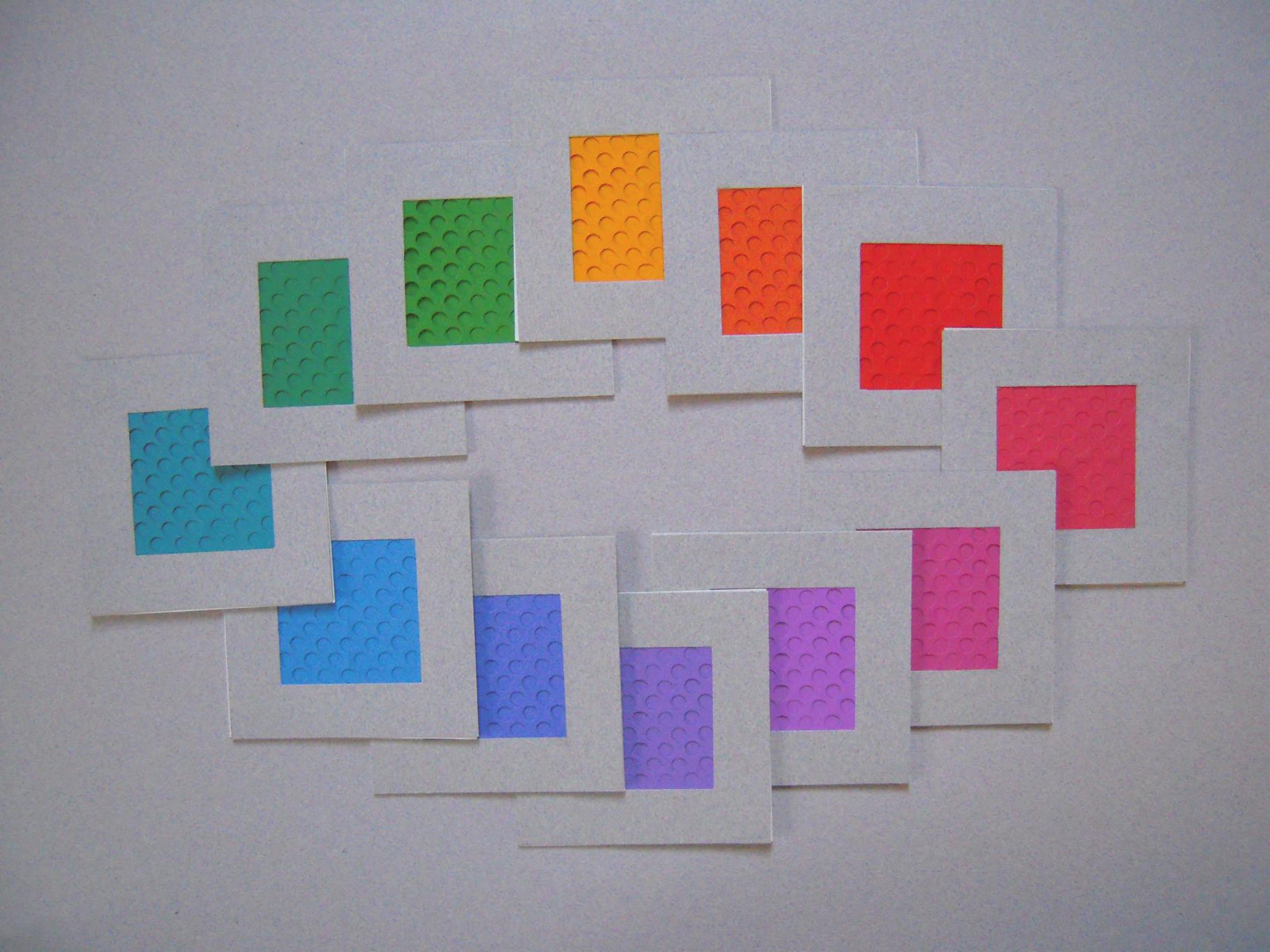
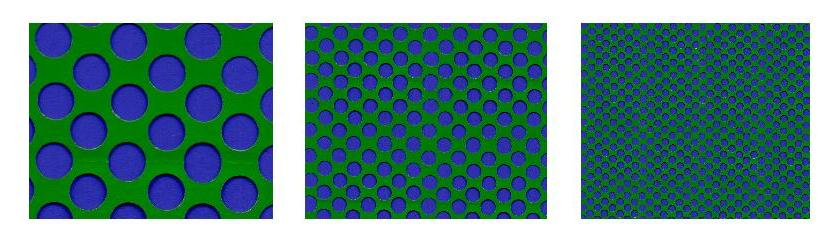
The most basic framework for organizing colours is the colour wheel or circle, with the three primaries yellow, red, and blue in tri-corner positions, the secondary colours orange, violet, and green ranged between them along with as many transitional hues as you have room for. For a colour course at the Ontario College of Art, I acquired a set of coloured papers that gave me a representation of the colour wheel in twelve steps, then for each step I prepared a screen that provides 50% coverage. This set of cards makes for a creative game of solitaire, observing the effects of complementary contrast, near-complementary interference… as well as ordinary colour mixing.
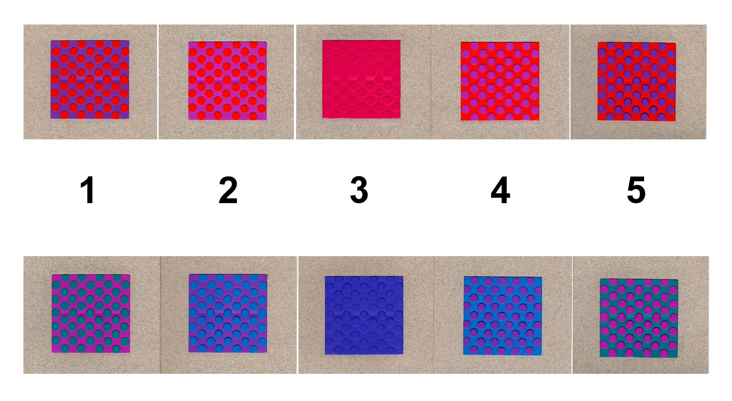
Here is a simple but surprisingly clear example, to view the effect of mixing adjacent hues. If I select a colour to simulate, and the two adjacent hues on each side, I have a range of five, enough to span from one primary to another. Leaving 3 alone, I exchange the screens between 2 and 4, also 1 and 5. They all give a somehow balanced impression of the colour of interest at 3; 2 and 4 are similar, convincing, and more vivid than 3; at 1 and 5 the more divergent hues and their light/dark contrast become more distracting (I learned to call this “razzle-dazzle” – the effect of yarn colours so contrasting, it’s more sparkle or noise than blending). In practice, there can be more than two yarns in the weft: highlights and accents of a range of hues and light/dark tones, probably anchored by the best available mid-range choice.
When it came to constructing colour wheels in weaving, the logic and progress of my study dictated that I consider any given yarn colour to be one of my “primaries”, a mixture of yarns in one weft a “secondary”… and a combination of more than one weft, by hachure for example, a “tertiary” mixture.
One of the first observations is that colour in wool yarns expresses the whole range of light and dark value native to pure hues, from yellow intense but very light, to violet approaching black. Arbitrary mixtures of these are likely to produce a lot of razzle-dazzle.
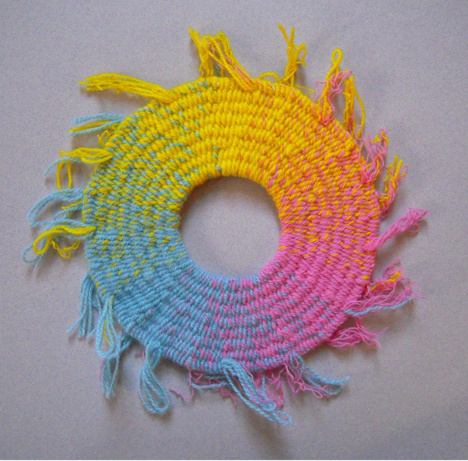
3 primary yarn colours
To address this, in a colour wheel composed of just three primaries, I selected yarns that were lighter (thus less intensity) so that value wouldn’t be a problem. Helped by that, they blend and transition smoothly from one to the other, with impressions of green, orange and mauve along the way.
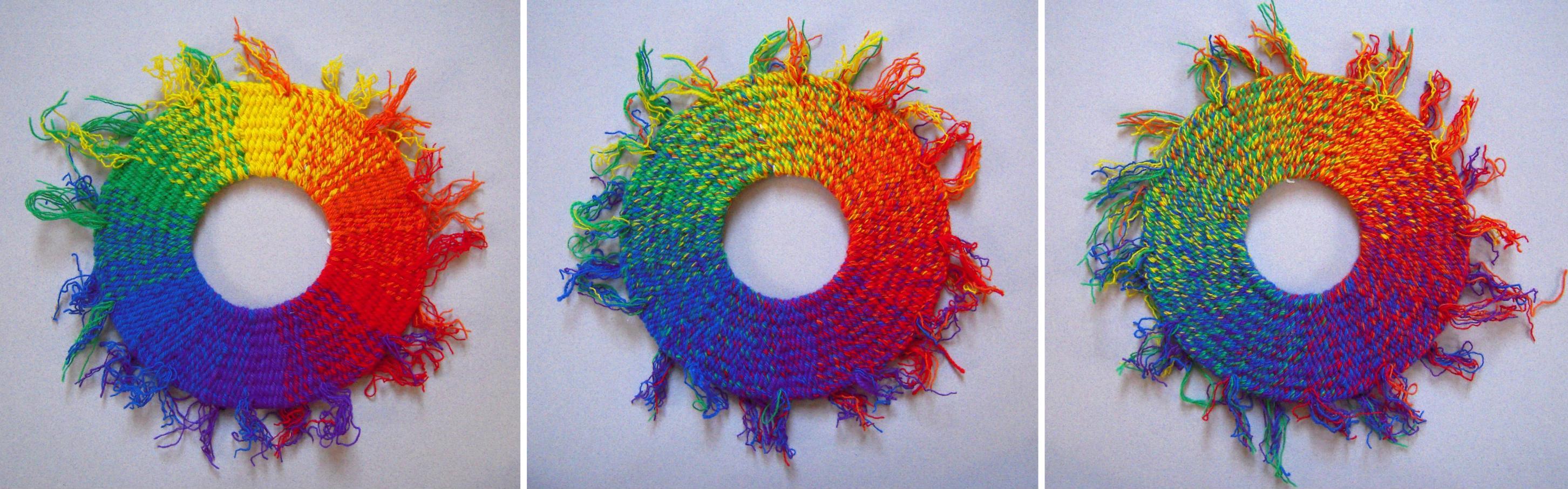
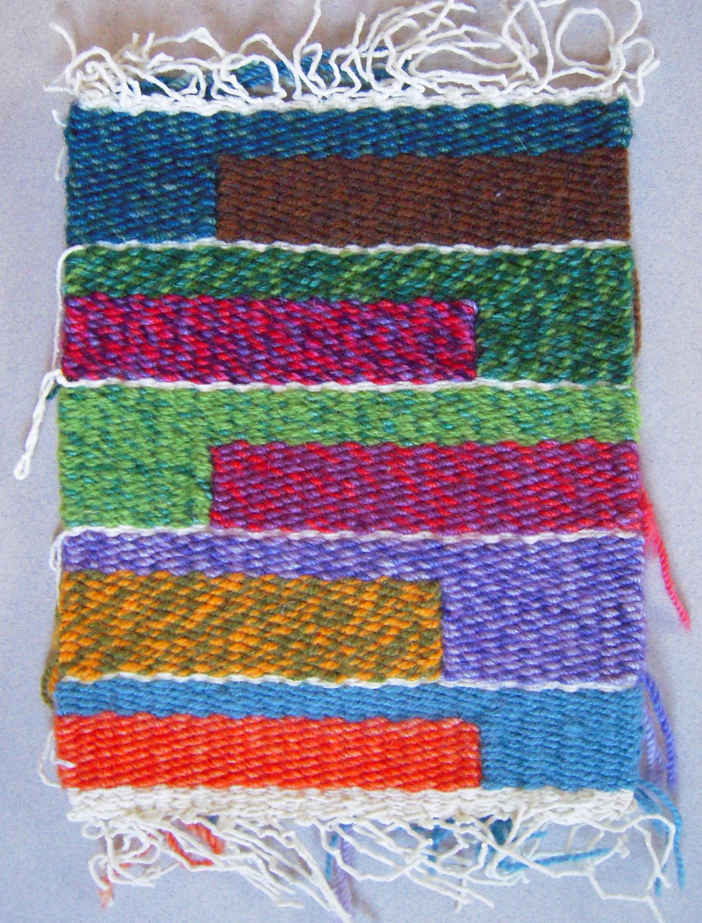
The same 6 yarn colours in various mixtures
The same 12 yarn colours in various mixtures.
On the other hand, both six yarn colours and 12 yarn colours offered plenty of scope for blending intermediate hues, subject to the distractions of light/dark contrast, and the toning effects of colours too dissimilar. Each of 24 wefts consists of 12 single yarns of one colour or in fixed proportions such as 6+6 or 6+4+2.

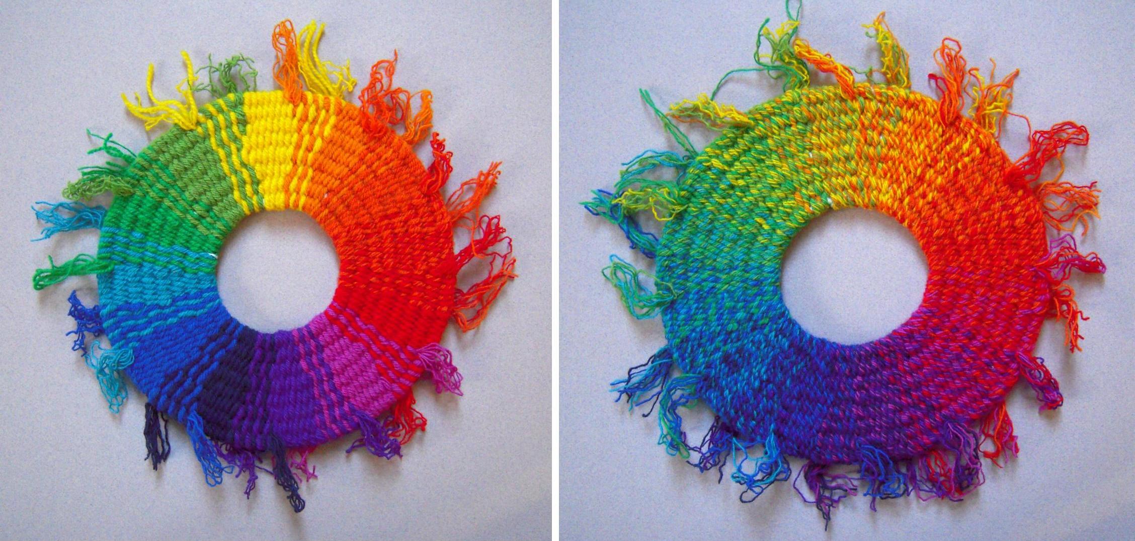
4 primary yarn colours
Even just four “primary” colours is a big improvement on three. Of the four yarn colours, I chose the yellow-orange and yellow-green to blend more easily with darker hues. It was not very successful – the yellow-green yarn seems too yellow to blend well with the blue. The yellow-orange yarn is mistaken for yellow itself, while the mix of the two yarns makes for a darker mustardy or olive tone of yellow.
Perhaps my best insight was that my available yarn colours – all of them – are fixed and therefore “primary”, with connotations of both arbitrariness and resource. Drawing from a wide range of yarns offers multiplying combinations that can only be discovered and judged by eye. I’ve learned that light tints of various hues are the hardest to substitute, and that it’s useful to distinguish the faint hues of various grays.
The “experience” I keep citing as the way to gain control of these colour effects, is long but never in the sense of a programmatic apprenticeship or delayed gratification. The hours I spend weaving are all pure play anyway, but even more so when I’m sampling not in preparation for a bigger project, but to observe colour effects and relationships.

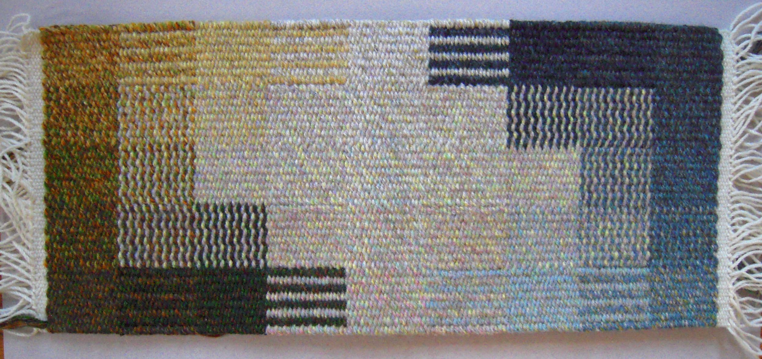
5 colour square sampler format
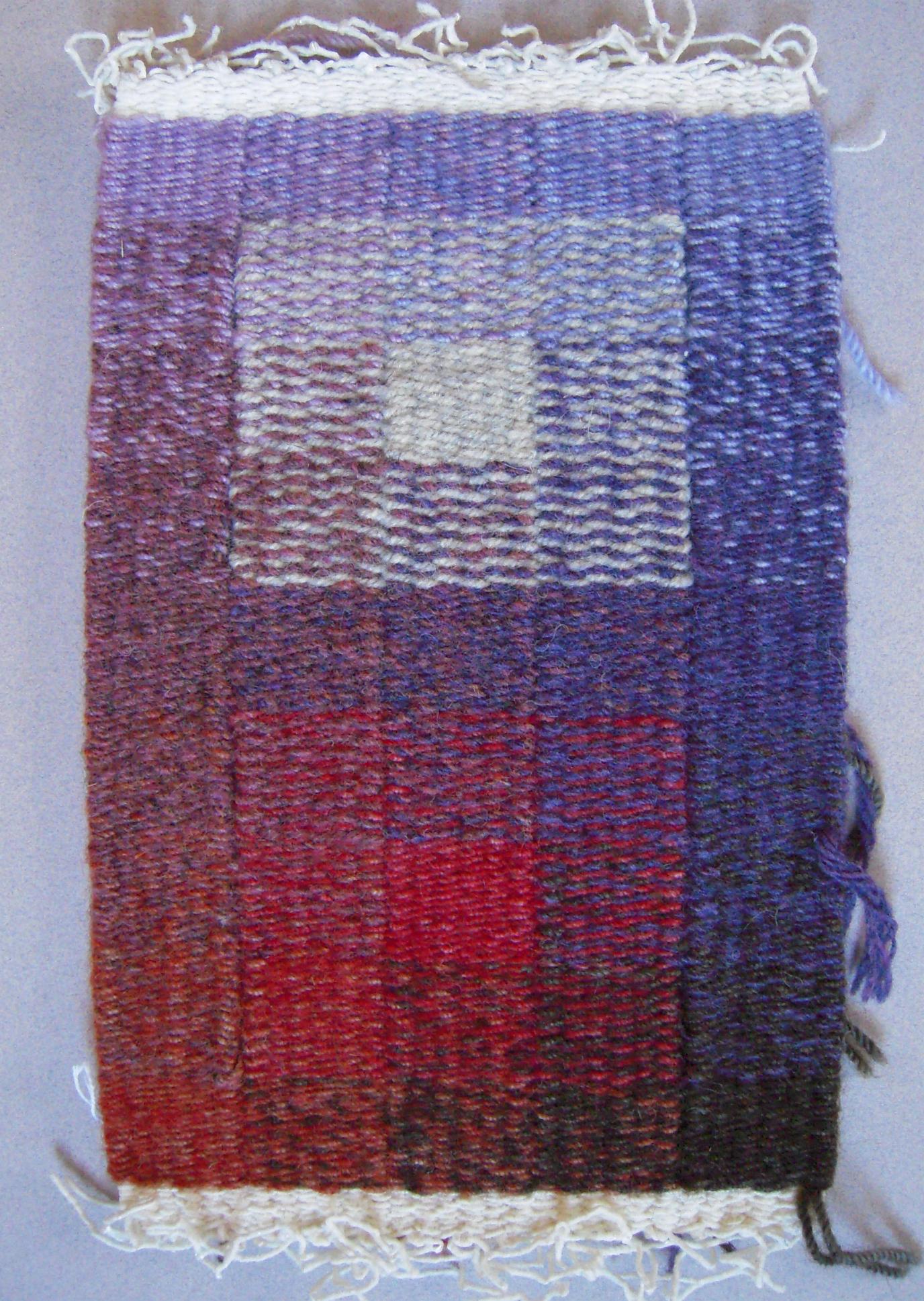
sampler for Annapurna