Chashm-i-bulbul, kani, and optical colour mixing
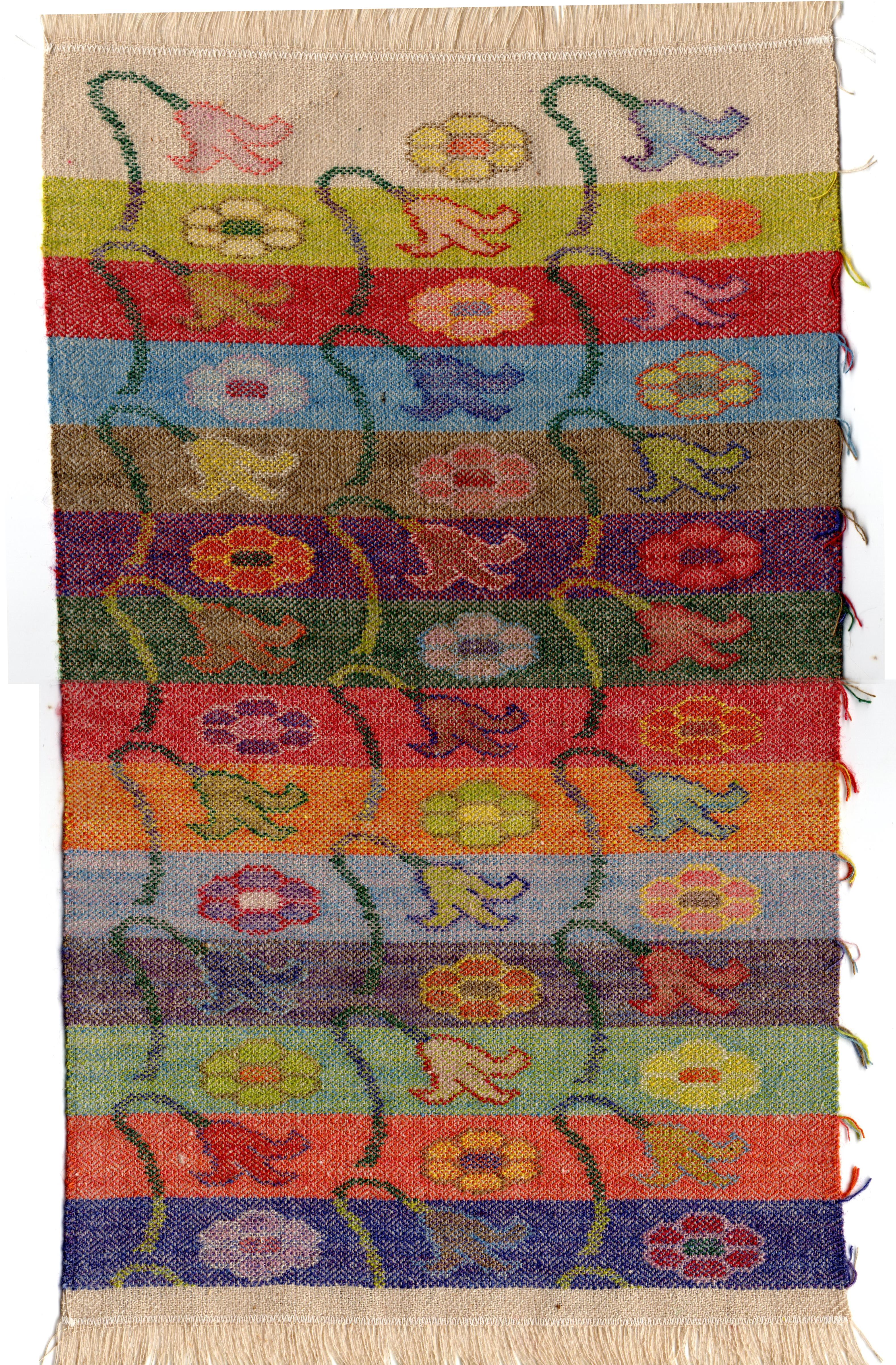
Chashm-i-bulbul, kani, and optical colour mixing – three keyword searches that only converge here! Not wanting to waste or leave hanging the remainder of my warp with chashm-i-bulbul threading, and now in the presence of 12 colours of the same 1/20’s tussah silk yarn altogether, and three at any one place in the weaving, I determined to sample as many different combinations as possible.
The warp colour is a given and appears to some extent throughout. The natural/white silk tends to lighten and weaken the weft colours from a distance, and sparkle and break up colour effects close up. For a project, the colour could be chosen to blend more readily, or to highlight the chashm-i-bulbul pattern.
Also appearing throughout is the shuttle weft, alternating with each pick of the kani-woven wefts that define the design. The colour of the shuttle weft will contribute everywhere a bit less than the kani wefts, because of some tighter interlacements completing the chashm-i-bulbul pattern. The kani wefts, even the same thickness, always appear as stitches spanning two warps, floating a little more prominently. Many aspects of harmony and contrast can be considered in the choice of shuttle and kani-weft colours, especially in broad areas of kani-woven background. For my purpose this offered many opportunities to observe individual combinations, and the effect of the shuttle weft pervading each section of the sampler.
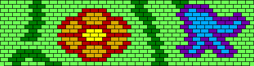
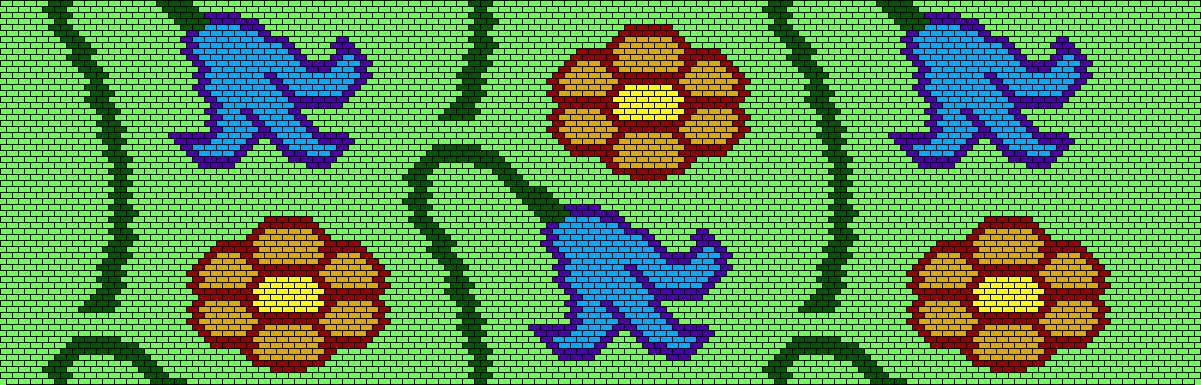
I used a design which I had previously devised as an example of a smallest-possible pattern-repeat for kani weaving, providing some vertical continuity and complexity in the off-set rows of repeats, and allowing any number of combinations in the flower outline and fill colours. Originally the size of the repeat was just 16 rows of 30 units on a brick grid, where each line of instructions is woven in two picks. I complained more recently that a detailed brick-grid design (2PPTL) in this technique when each line of instructions is woven only once, led to many awkwardly-parked wefts. I doubled the size of the design – twice the number of rows and units on the Stitch Painter grid – and edited. This allowed me to refine the design while ensuring that wefts making long horizontal passages could return in the next line.
Each row of pattern repeats – each colour-way of the sampler – follows 32 lines of instructions alternating with 32 picks of the shuttle weft. The chashm-i-bulbul weave pattern repeats on a cycle of 20 treadlings, so after working through 10 lines of kani instructions. The difference between these two cycles has no effect on the design, because the kani stitches are always appearing on the same opposite pairs of warps, in a brick-grid arrangement. On my pages of 64 numbered lines of kani instructions (2 rows of design repeats, including the off-set), every 10 lines signals a new treadling cycle, so it is always possible to re-establish where you are in the treadling sequence, something easy to lose track of when plain shuttle-weaving is interrupted.
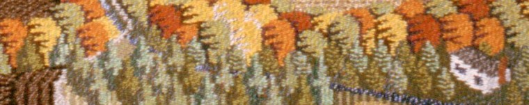
I found that the chashm-i-bulbul pattern shows up most clearly on the light warp if the shuttle weft and the kani background weft are both relatively dark: the same colour, or a mixture of similar light/dark value – the resulting hue is another question. Too much difference in value between the two wefts, and the pattern disappears. If the kani weft colour is too prominent, it will show as a brick-grid arrangement of stitches. If the shuttle weft is too prominent, like the dark red in the 7th section, it can just look like a salt-and-pepper texture.
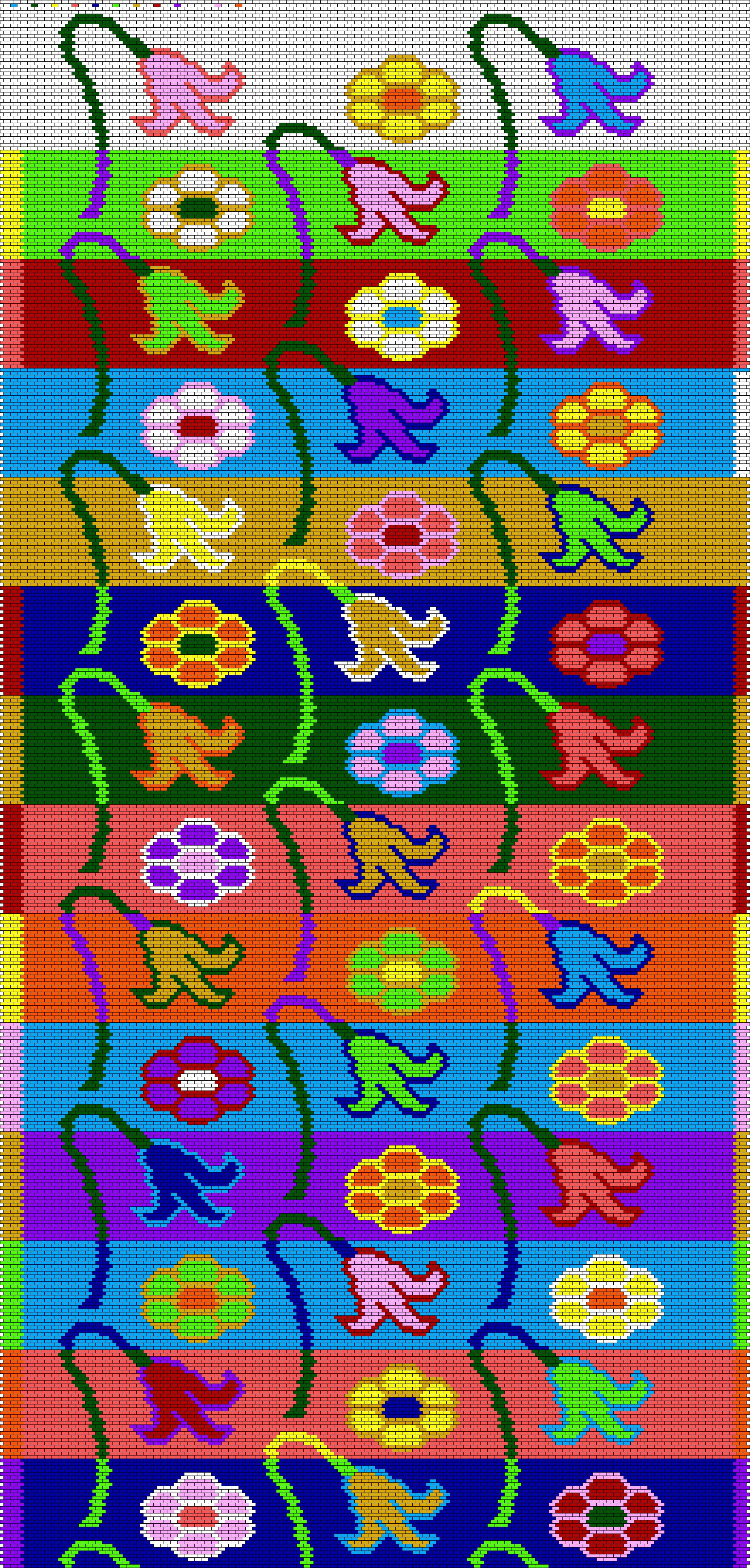
This key to the entire sampler shows the colours used as kani wefts, with the shuttle weft colours at the margins. Each section of the sampler began with the choices of colours for the shuttle weft and kani background weft, where the weave pattern would be most evident. I considered variety and contrast with preceding sections, to maintain my own interest. My colour combinations for flowers are somewhat naturalistic, though I only thought specifically of poppies and bluebells. Each of the three flowers in that section was a separate experiment with the underlying shuttle weft and surrounding background. I was always trying to make it show up clearly, by using light/dark contrast or complementary colours. Darker outlines seem sharper, but it’s surprising how effectively a light flower covers a darker shuttle weft. Often a combination I saw a little of in a flower petal, became the background expanse in a later section.
My purpose in using all threads of the same thickness is to represent fairly the effect of this novel weave structure on the intensity of the design compared with an entirely kani-woven structure. The sampler fabric finished up a little more weft-predominant than intended: 70 wefts to the inch compared with 50 warps, something that favours the intensity of the design, but not the proportions. Earlier samples in this project with thicker kani wefts showed the design to good effect, but hid the chashm-i-bulbul pattern. Many good choices to be made.

